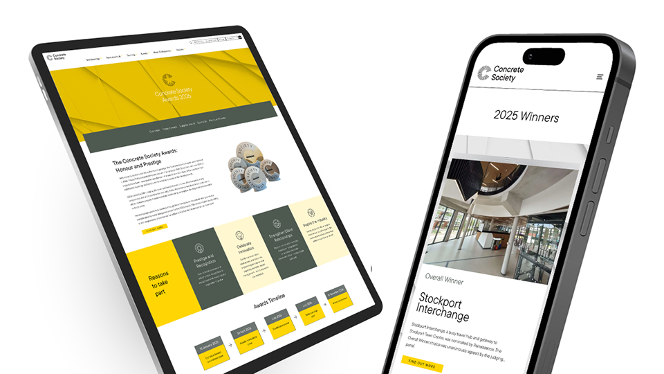
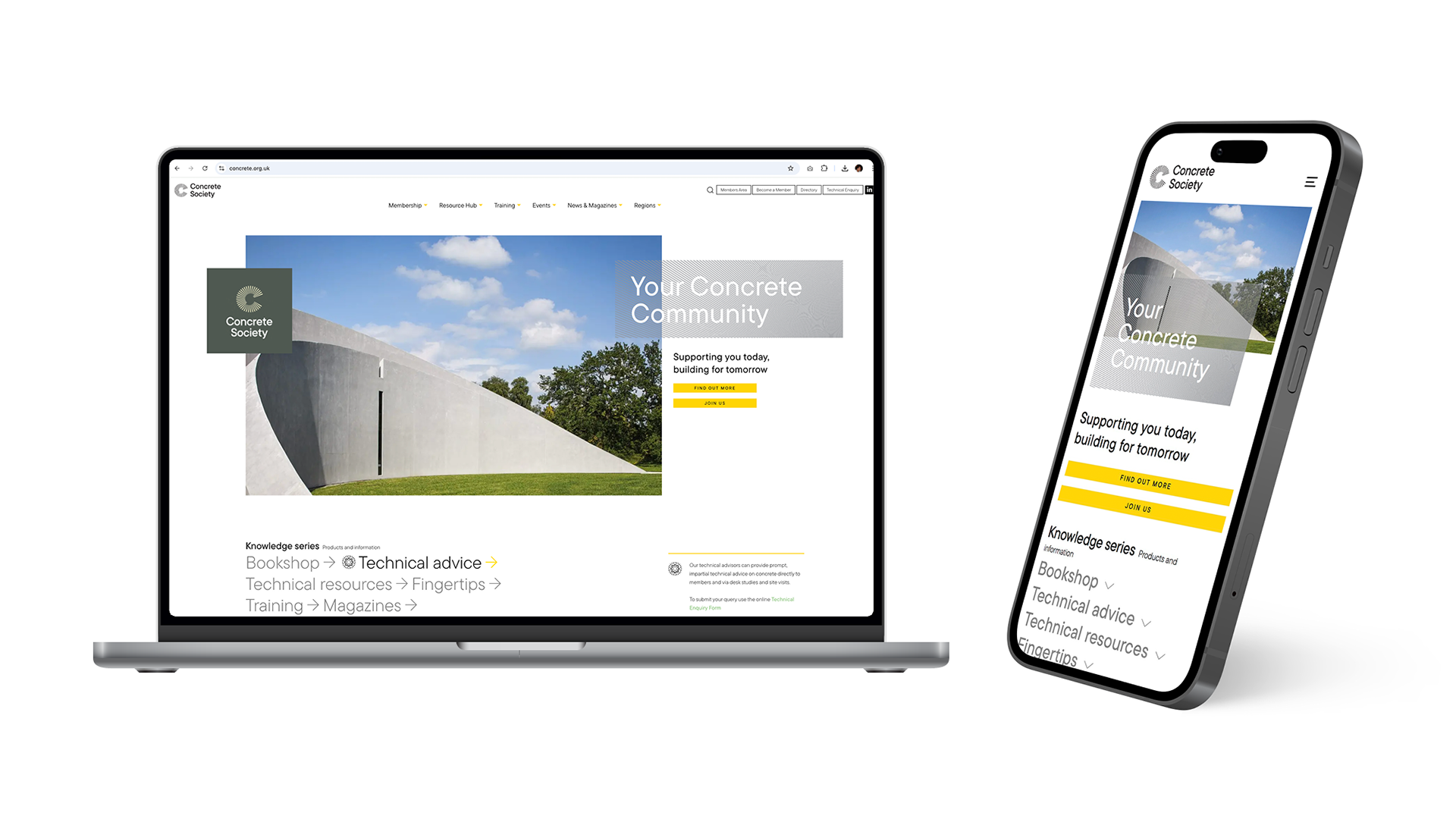
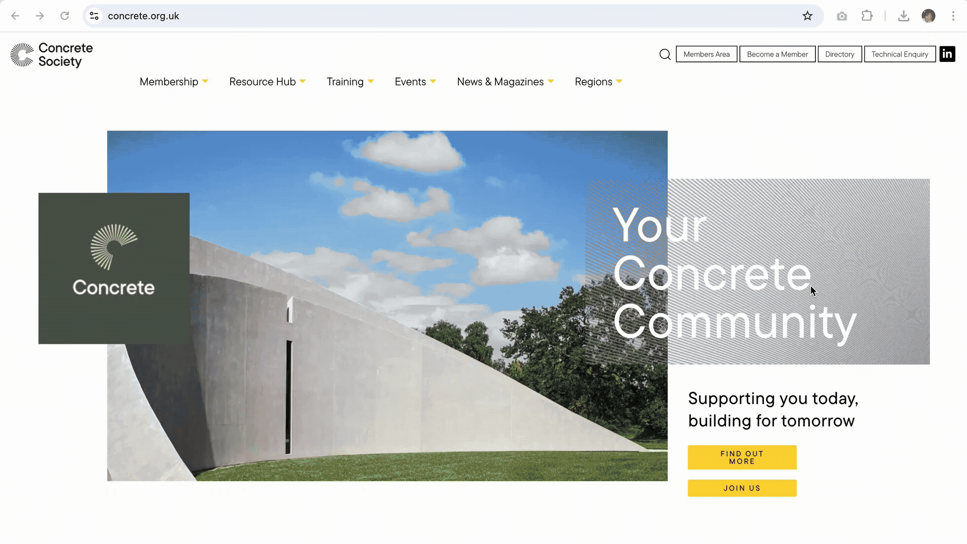
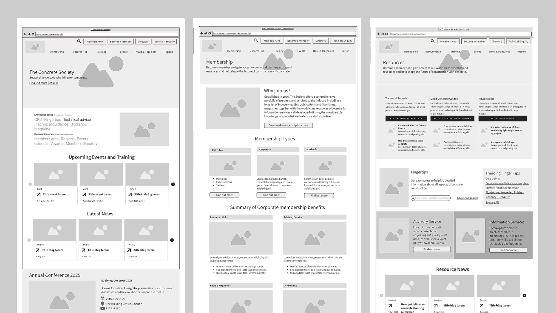
At the core of this project was complete redesign of the Society’s website. This began with a thorough UX research and discovery phase, and incorporated wireframes, visual design, and bespoke interactive tools
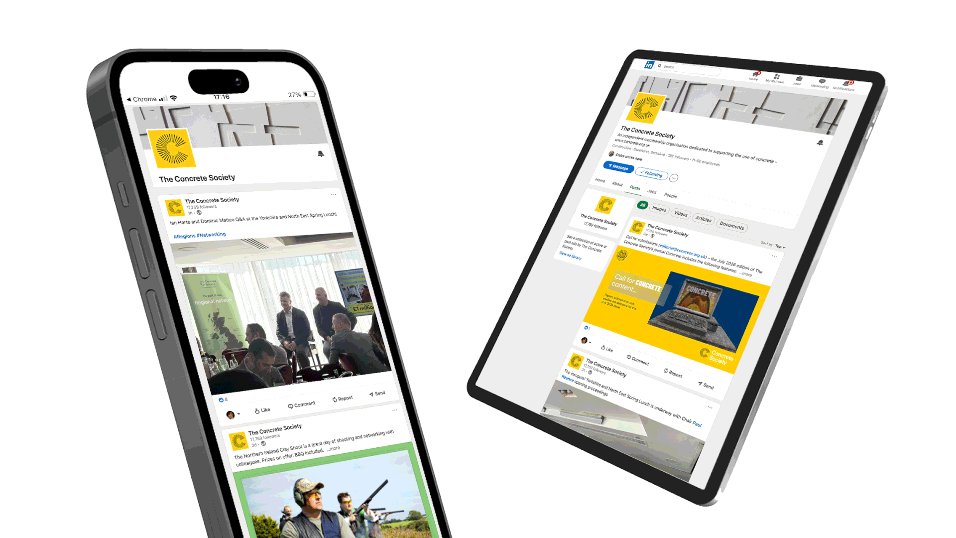
We developed a robust, scalable site and worked closely with their team to integrate their membership system—ensuring a smooth experience for both new and existing members. The result is a flexible digital platform and cohesive brand identity that will support their growth into the future.
Check out the Concrete Society website at concrete.org.uk

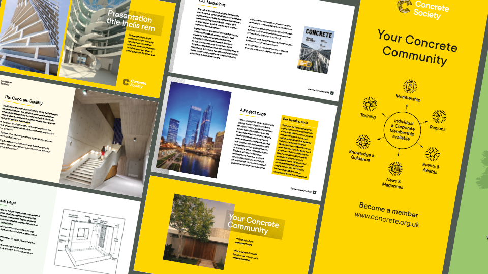
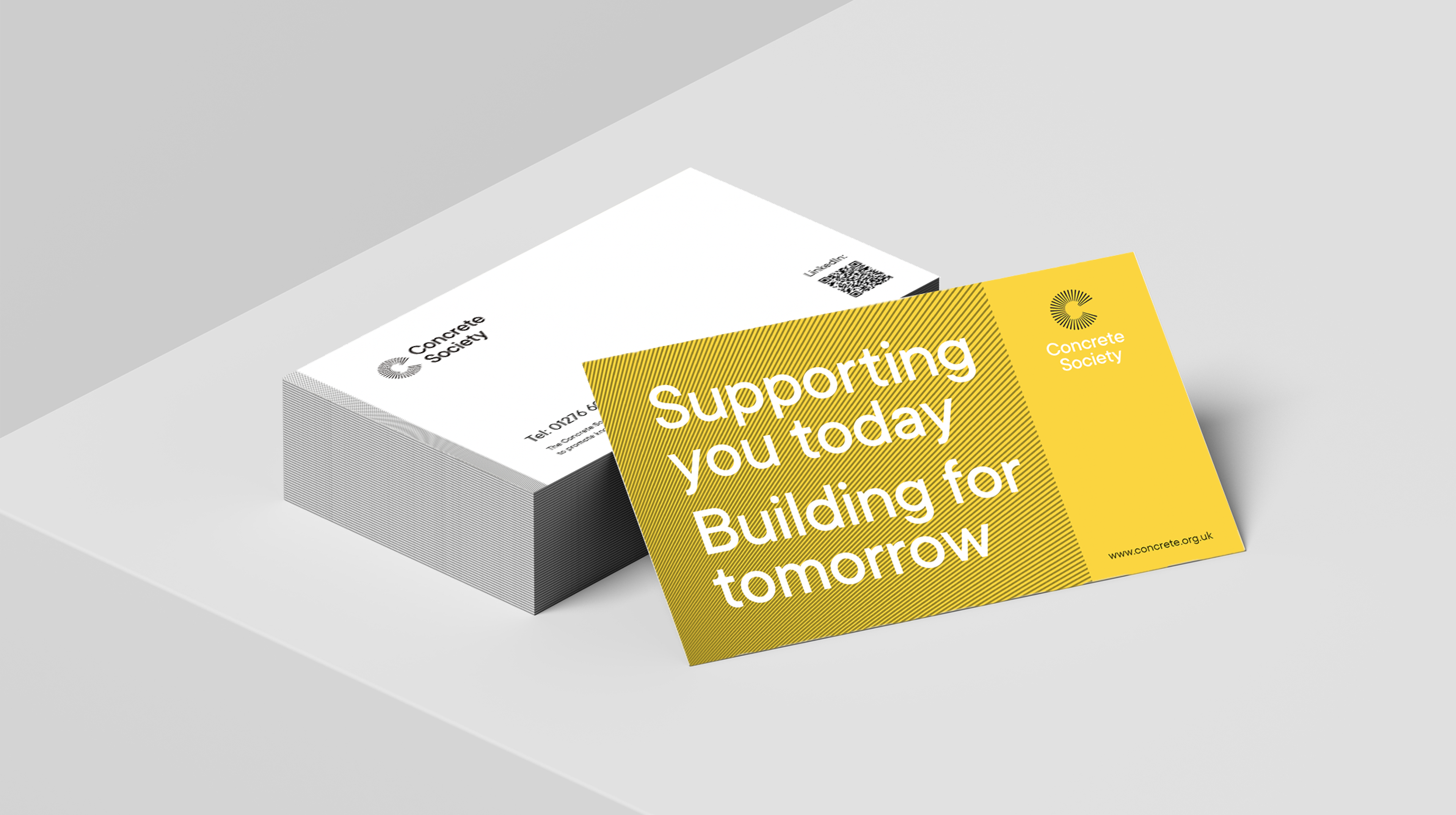
We worked closely with the Concrete Society team to produce a full set of launch collateral and templated resources that allowed the team to put out consistent branded materials, both online and in print.
This included Print ad & brochure templates, social graphics, Membership ads & collateral, assets catered towards events and regions, and a full redesign of the society’s technical publications
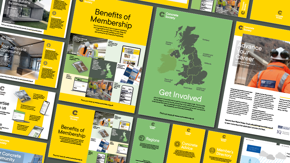

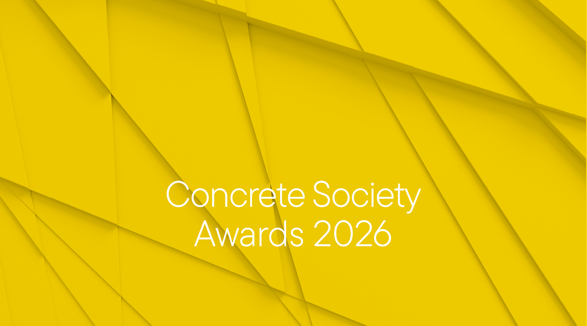
We also created extended brand projects such as the Concrete Awards and Evolving concrete events, whose sub - identities needed to feel part of the Concrete Society brand whilst retaining a distinct identity of their own . As well as a distinct event section of the society’s website, we created further templates and event graphics for individual events