We were invited by our friends at Montgomery to create a visual identity for their Food, Drink and Hospitality Week group, as well an updated suite of logos for the 5 co-located events.
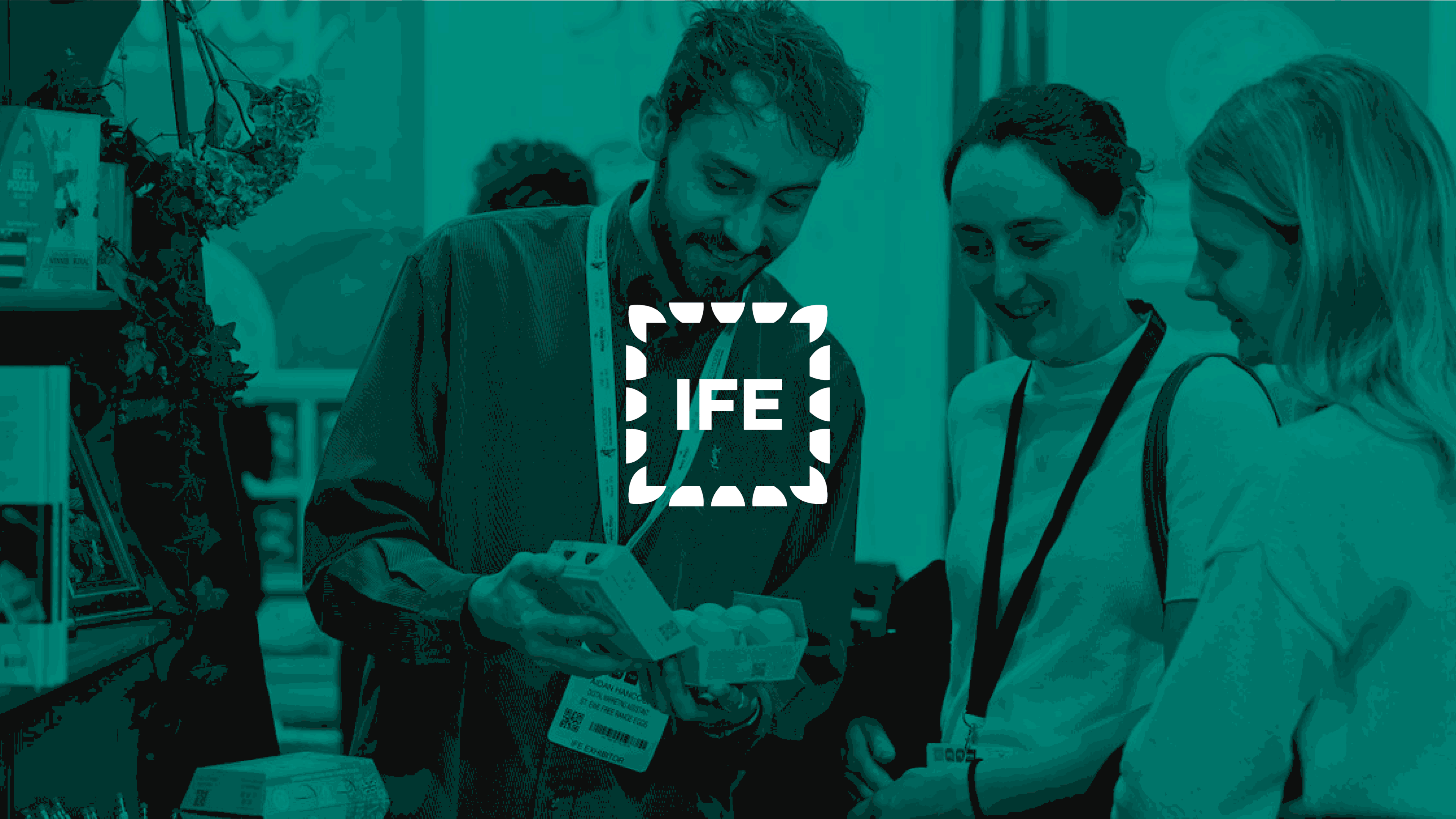
At the core of the project was the kind of detailed , graphic branding challenge that we relish: distill the essence of 5 co-located event brands into a set of icons that retain their previous personality but work as a coherent set ( the 5 events share a space at Excel )
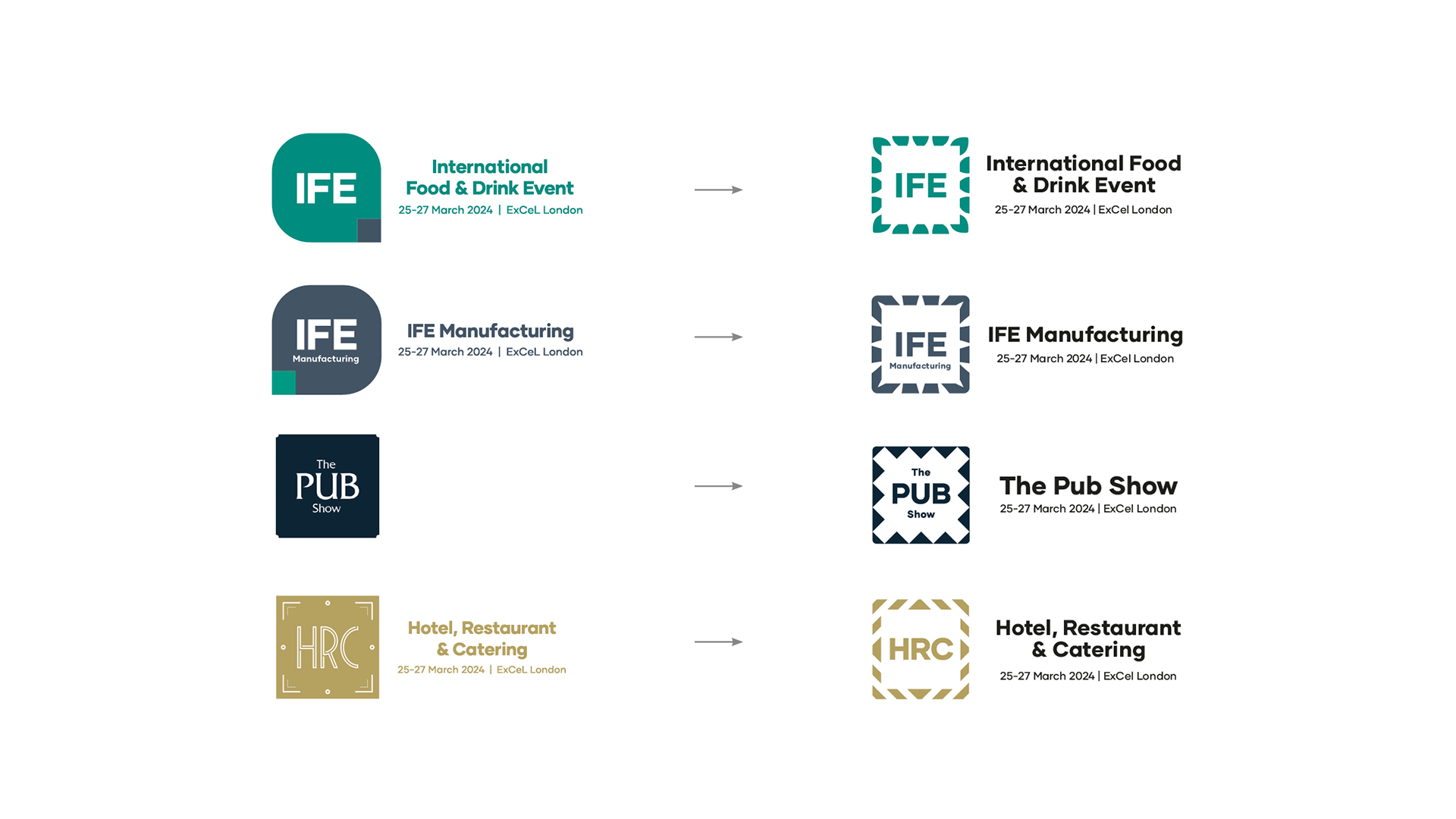
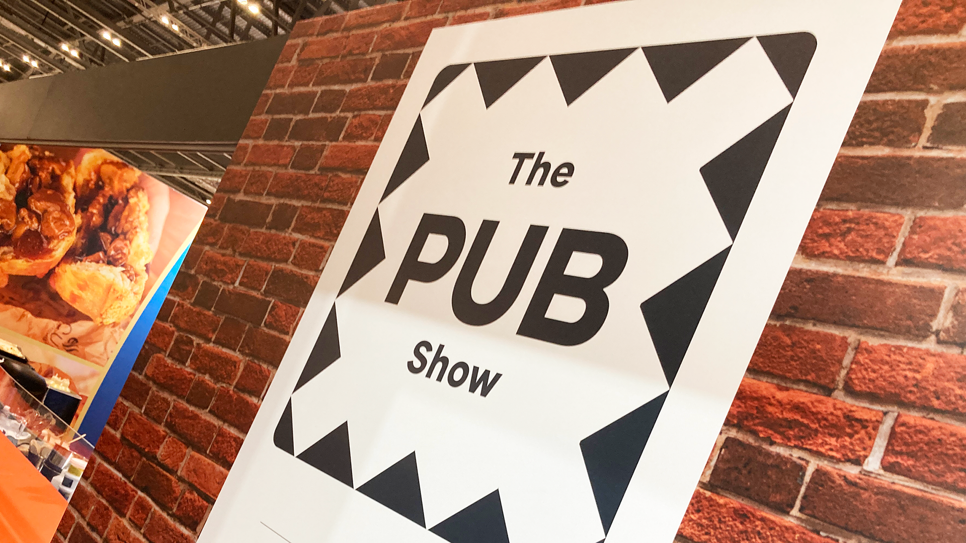
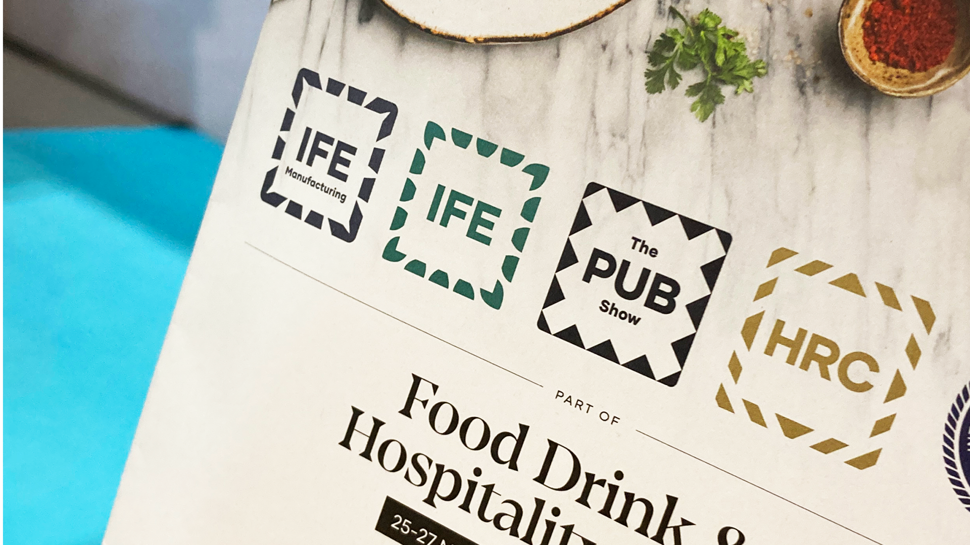
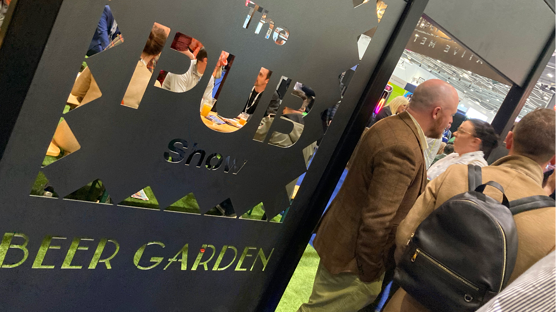
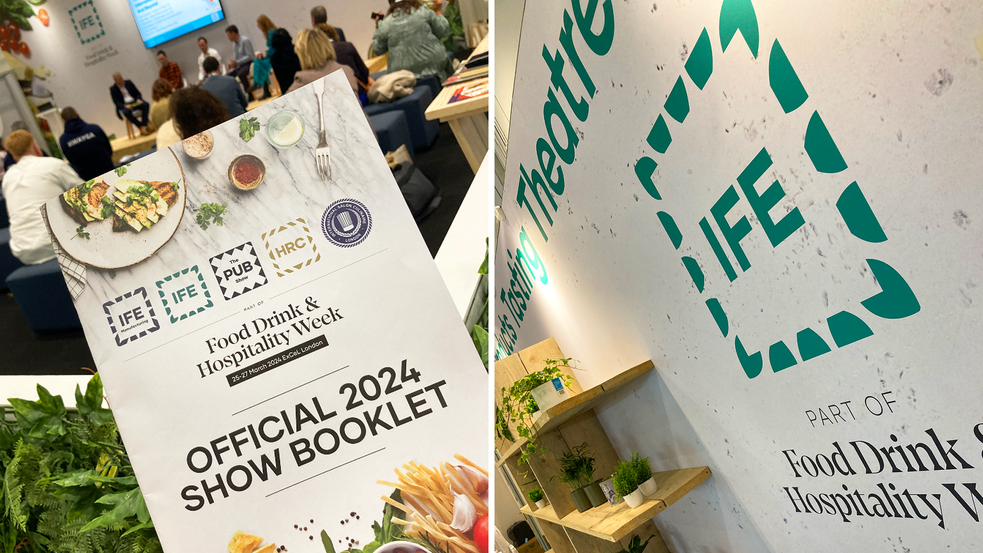
All of the symbols needed to work overlaid onto rich event imagery and ‘B-roll’ background video, as well as being replicated in different ways physically for event signage (eg cut out of metal for the PUB show zone) so we proposed evolving the existing set of disparate symbols into a single 1 -colour ‘border’ for each event that referenced the themes of the event and retained the spirit of the previous logo
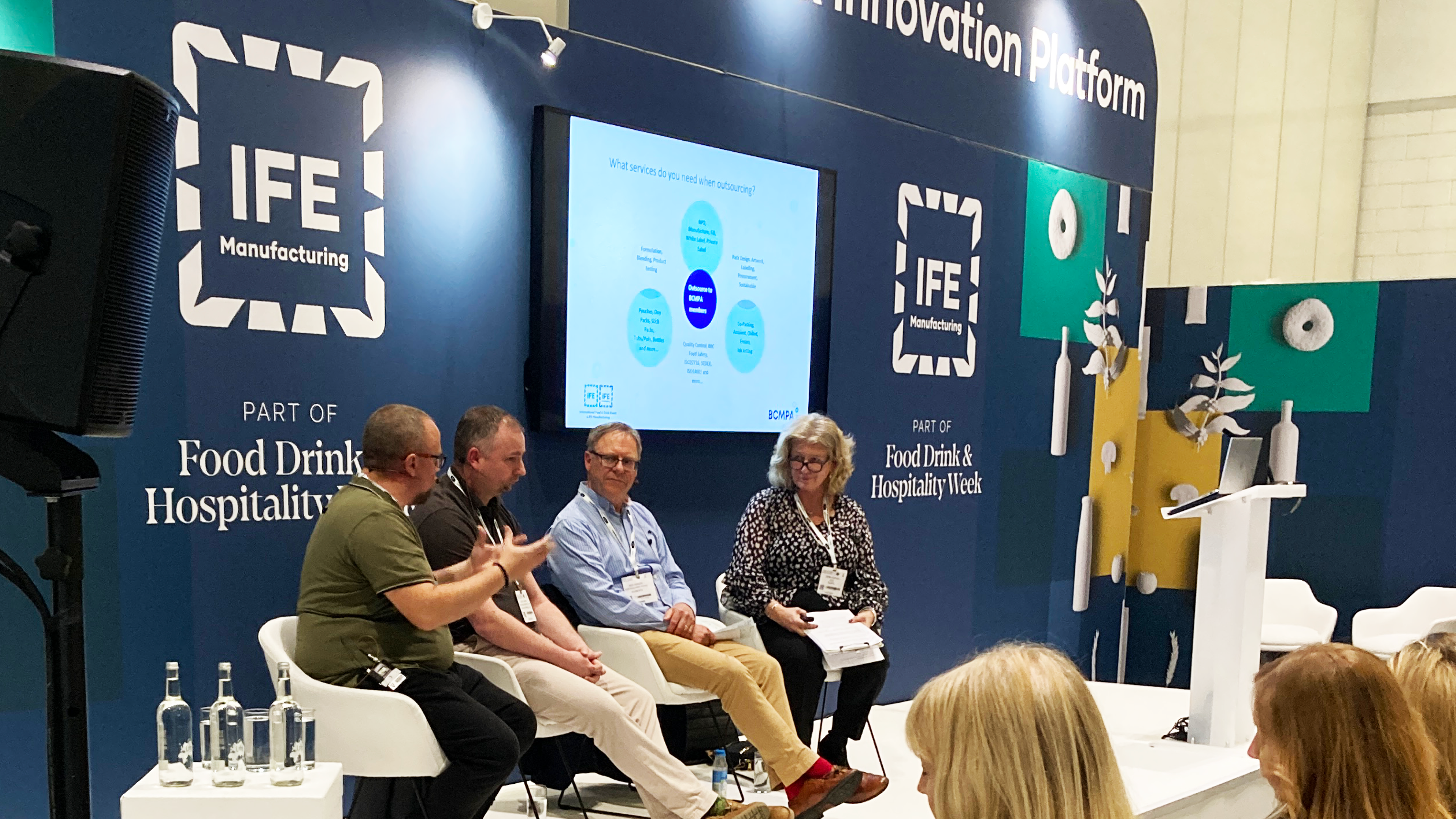
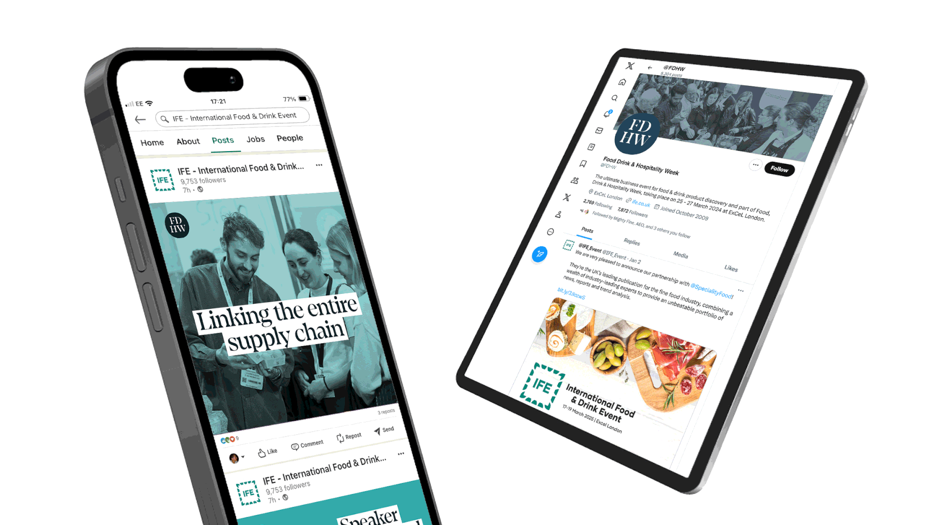
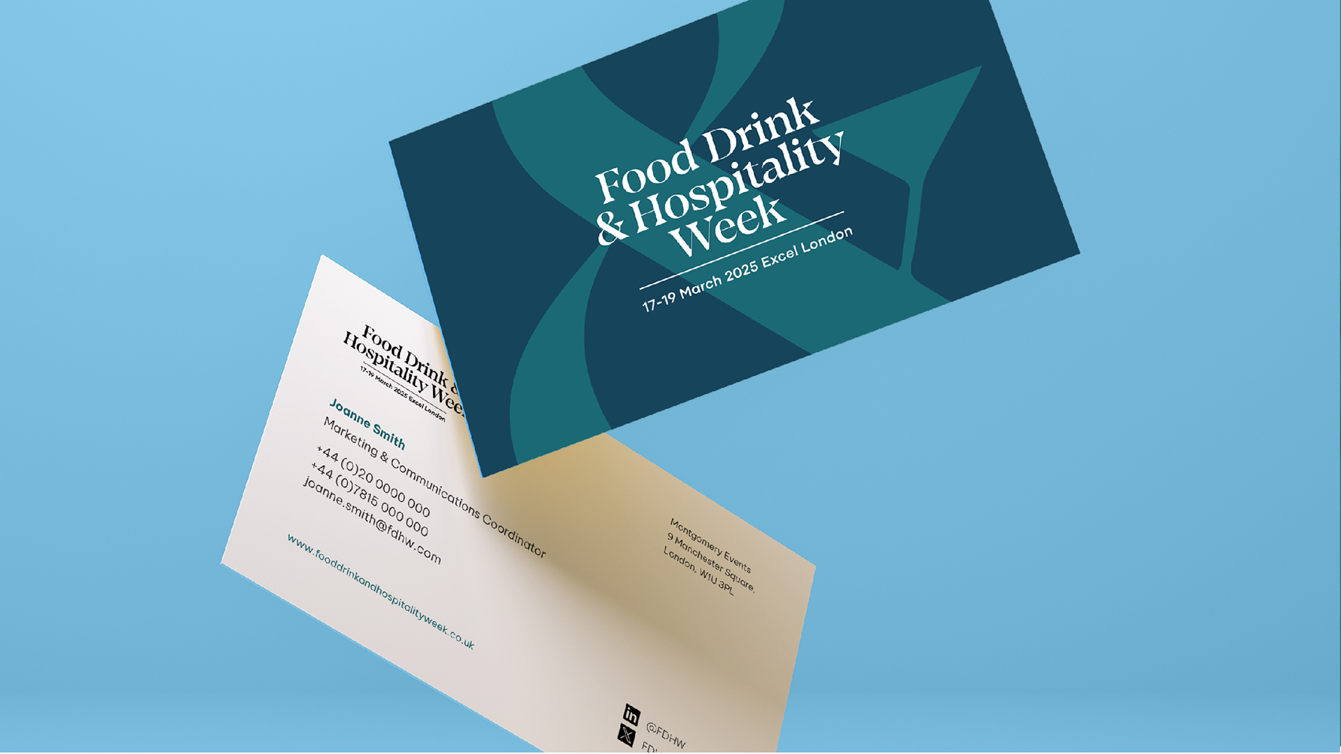
The refreshed identity was applied across 5 event websites, as well as event graphics, show guide, promotional flyers, web advertising & Social graphics
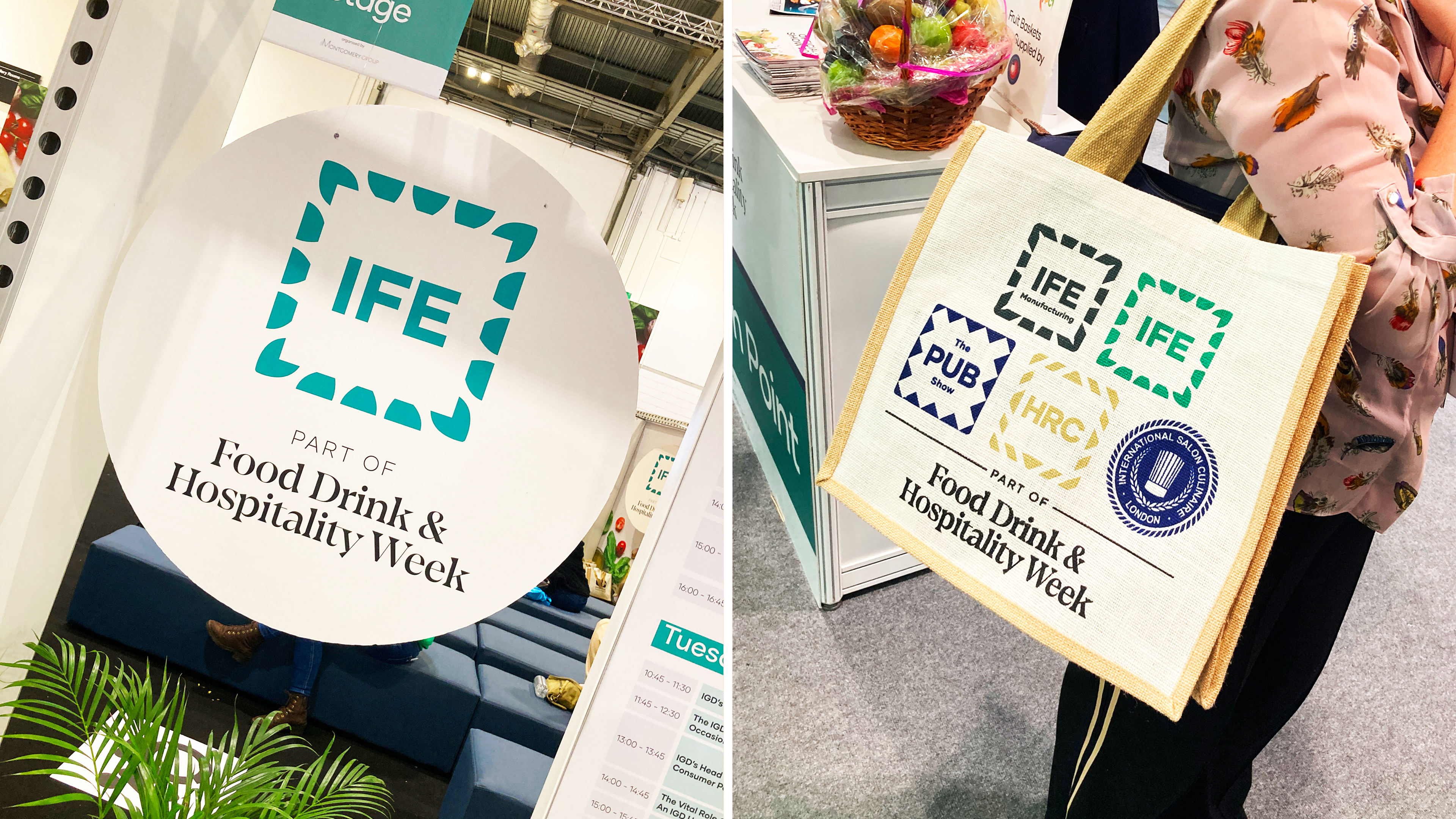
The border (and colour) of each symbol was designed to reflect an element of the existing ‘personality’ of each event brand; leaves reflecting the organic themes of the IFE (food and drink) event; folded paper for the IFEM (manufacture/ packaging) event; tiles for the PUB show, and a symbol for HRC (hotel catering ) event that distilled their existing Art Deco themed graphics into a single gold border
We later added a new technology event ‘HT 360’ to the same suite, applying the same principles to the branding
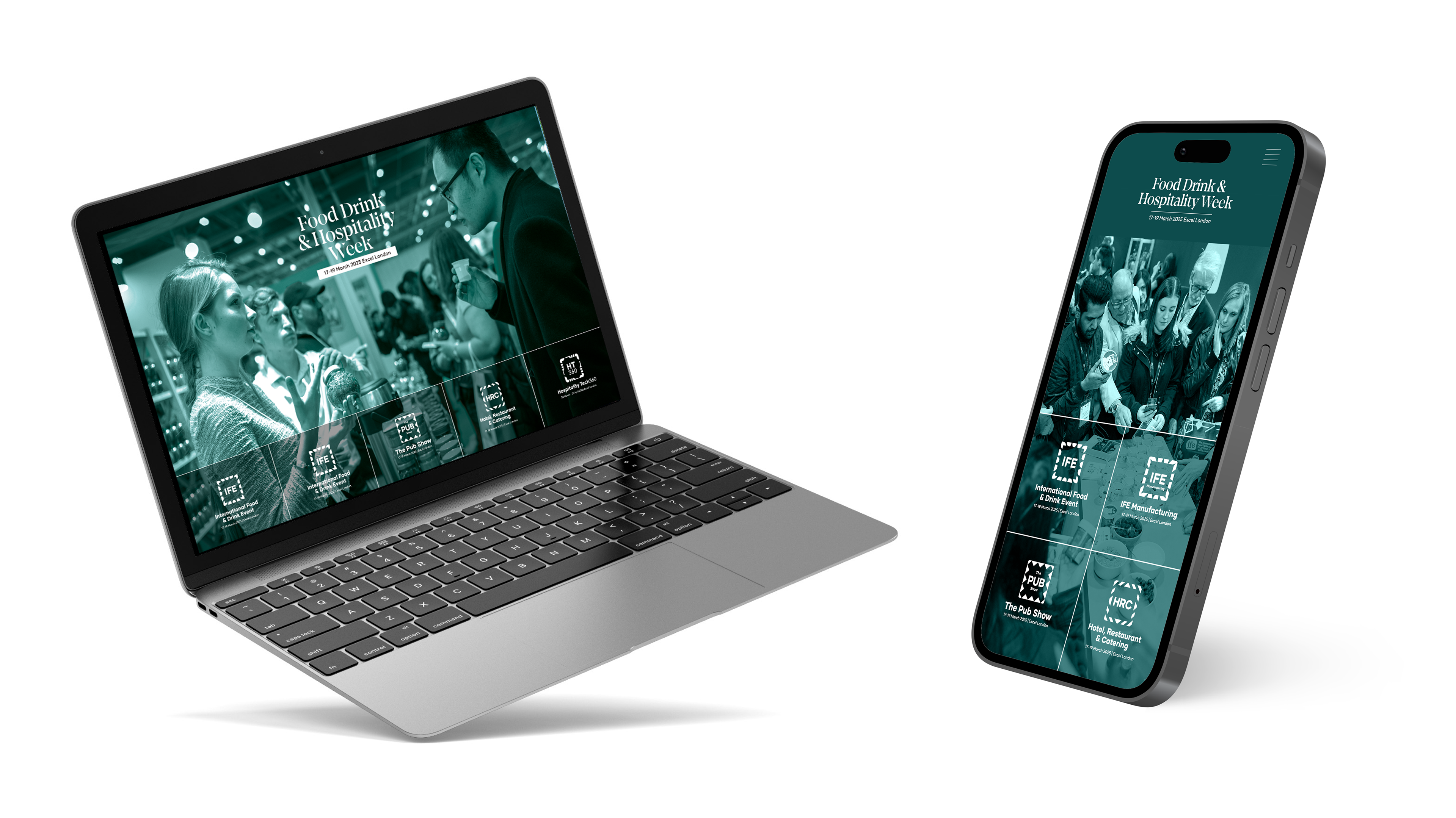
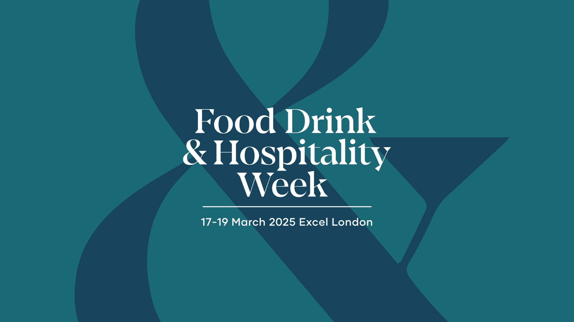
The group identity (Food, Drink & Manufacturing week ) needed to feel elevated, stylish, and separate from the event brands. We proposed a classic, restrained, type - only logo and a wider identity that used the ampersand as a key supporting graphic
We worked closely with the FDHW team to create various lockups and collateral templates, combining different types of event imagery and compiling ‘hero’ food & drink imagery to give each brand a personality of its own
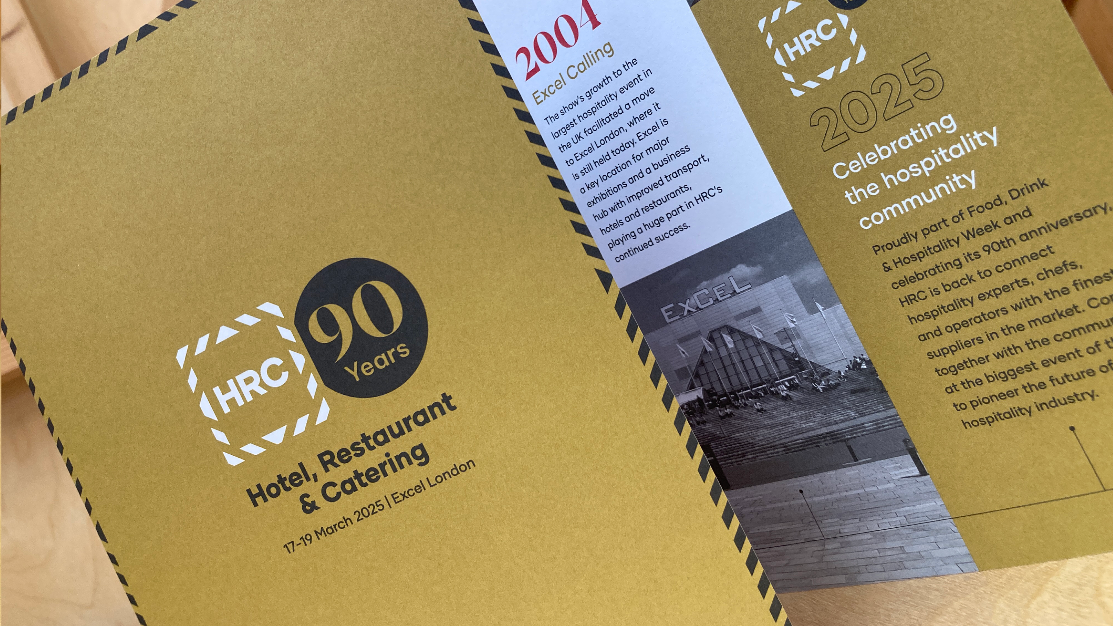
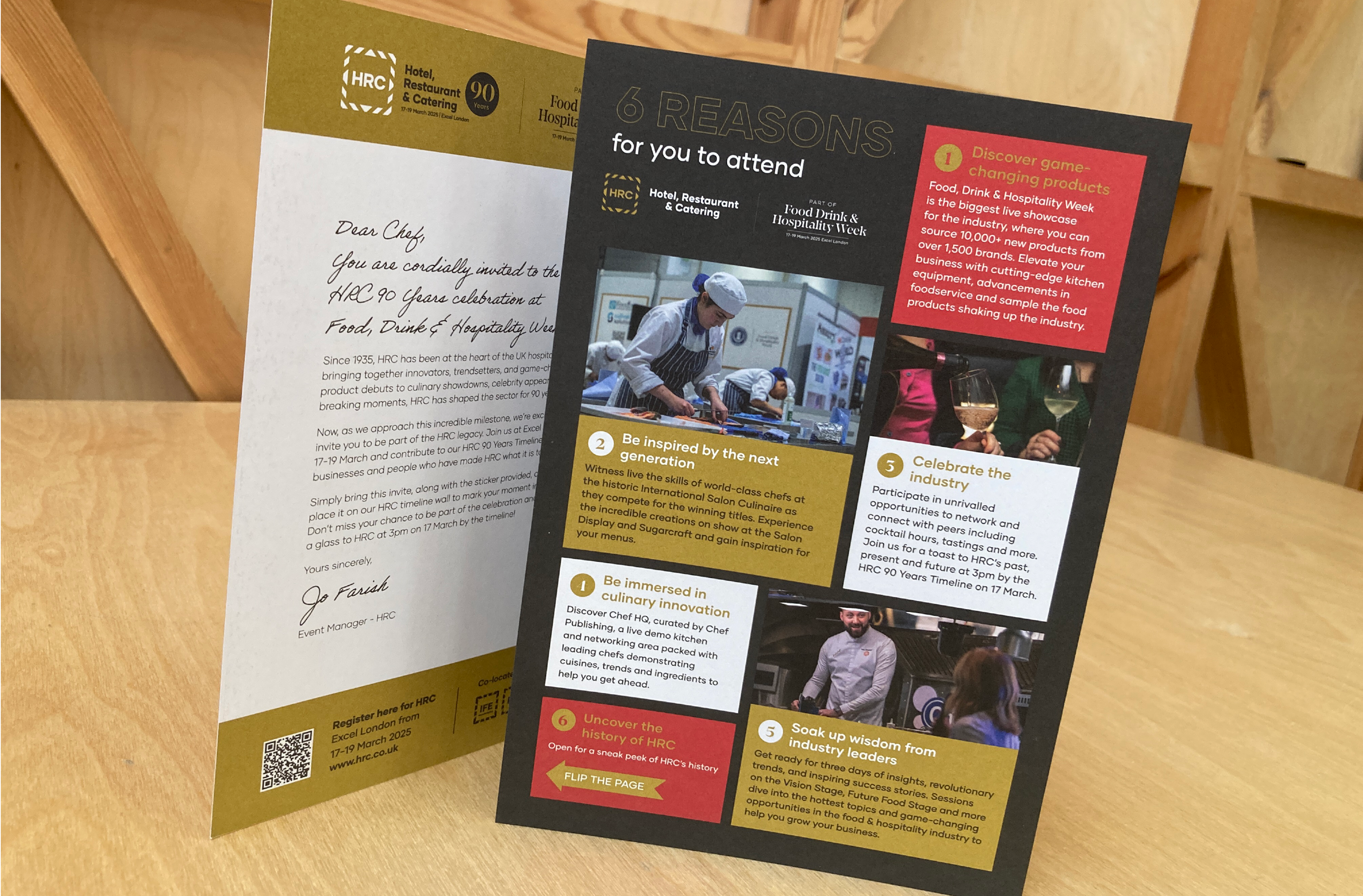
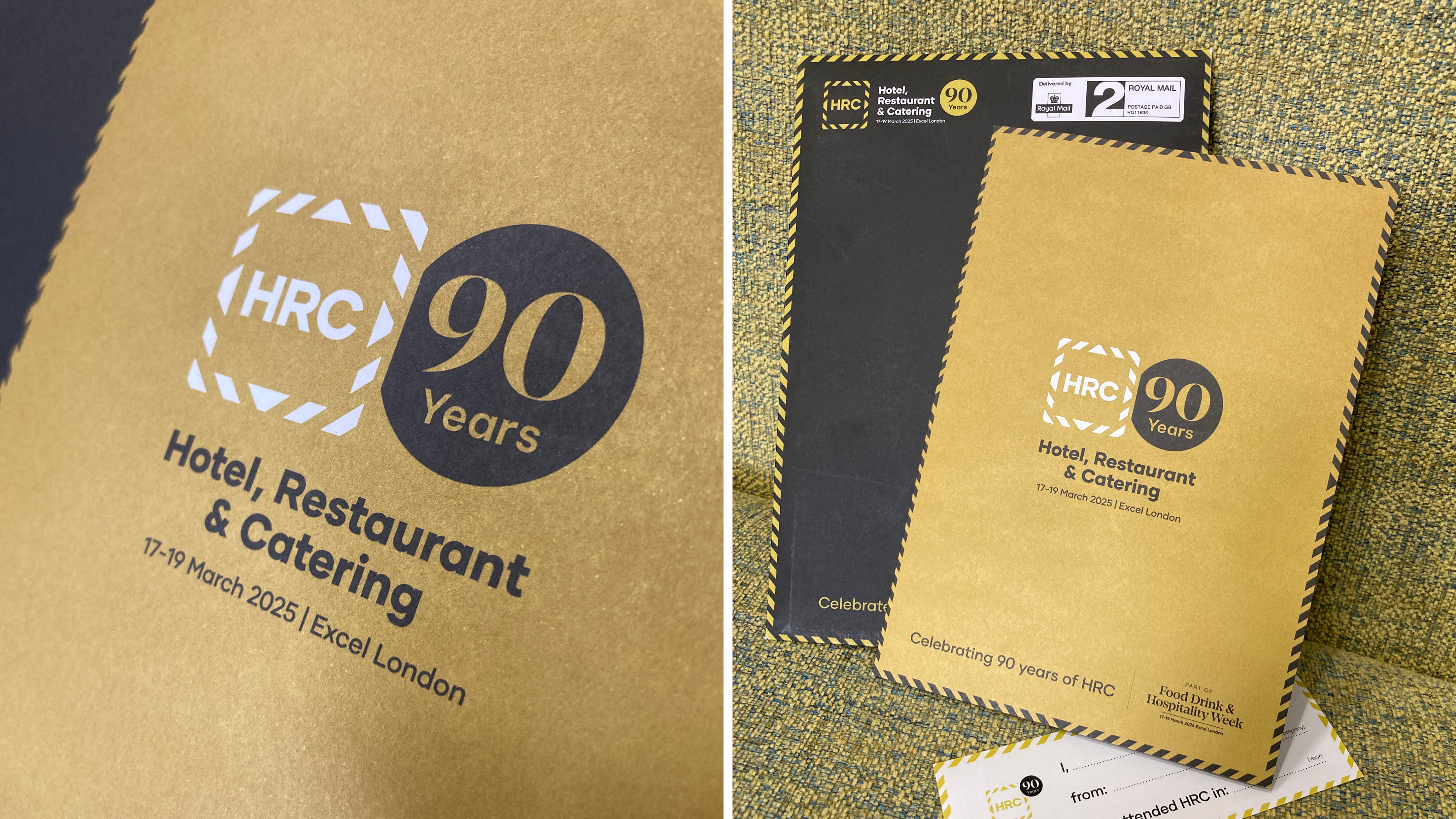
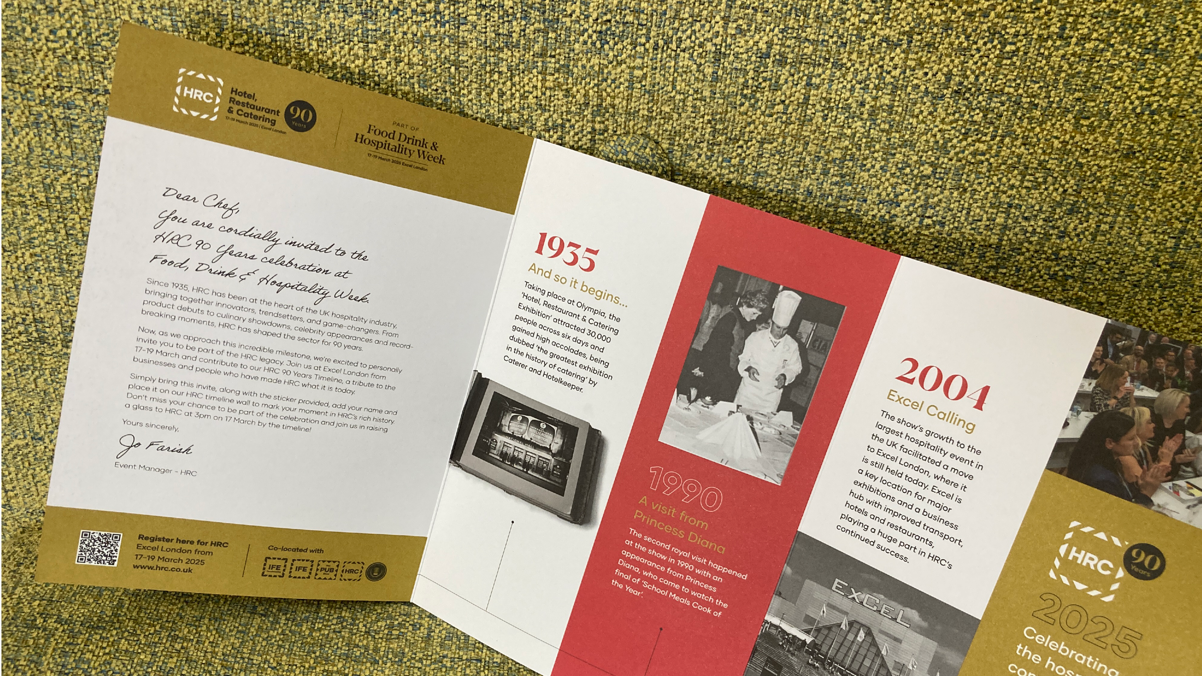
Following the rebrand, HRC event invited us to design & produce a direct mail piece part of its 90th birthday celebrations
We proposed a 6 page roll-fold flyer with bespoke envelope on Kaskad coloured card, both printed in gold metallic ink, incorporating a ’90 years of HRC’ logo lockup, a timeline showing a few key events from the event’s history, and a sticker that visitors could personalise and stick to a timeline wall at the event