We were commissioned by the American Hardwood Export Council (AHEC) to create an online, social and print campaign to demonstrate the qualities of Red Oak to architects, product designers and construction professionals. The main element of the campaign had to be an impactful image or short animation to attract attention online
First we came up with a visual identity for the project, at the centre of which was an animated ‘Red Oak Redefined’ logo. Then we proposed a series of 8 concepts for the main visual element of the campaign, all of which used animated, physical typography made from Red Oak to reveal specific positive characteristics about the species. For the first two concepts, we shaped the keywords out of red oak and manipulated them in real time via stop frame animation.
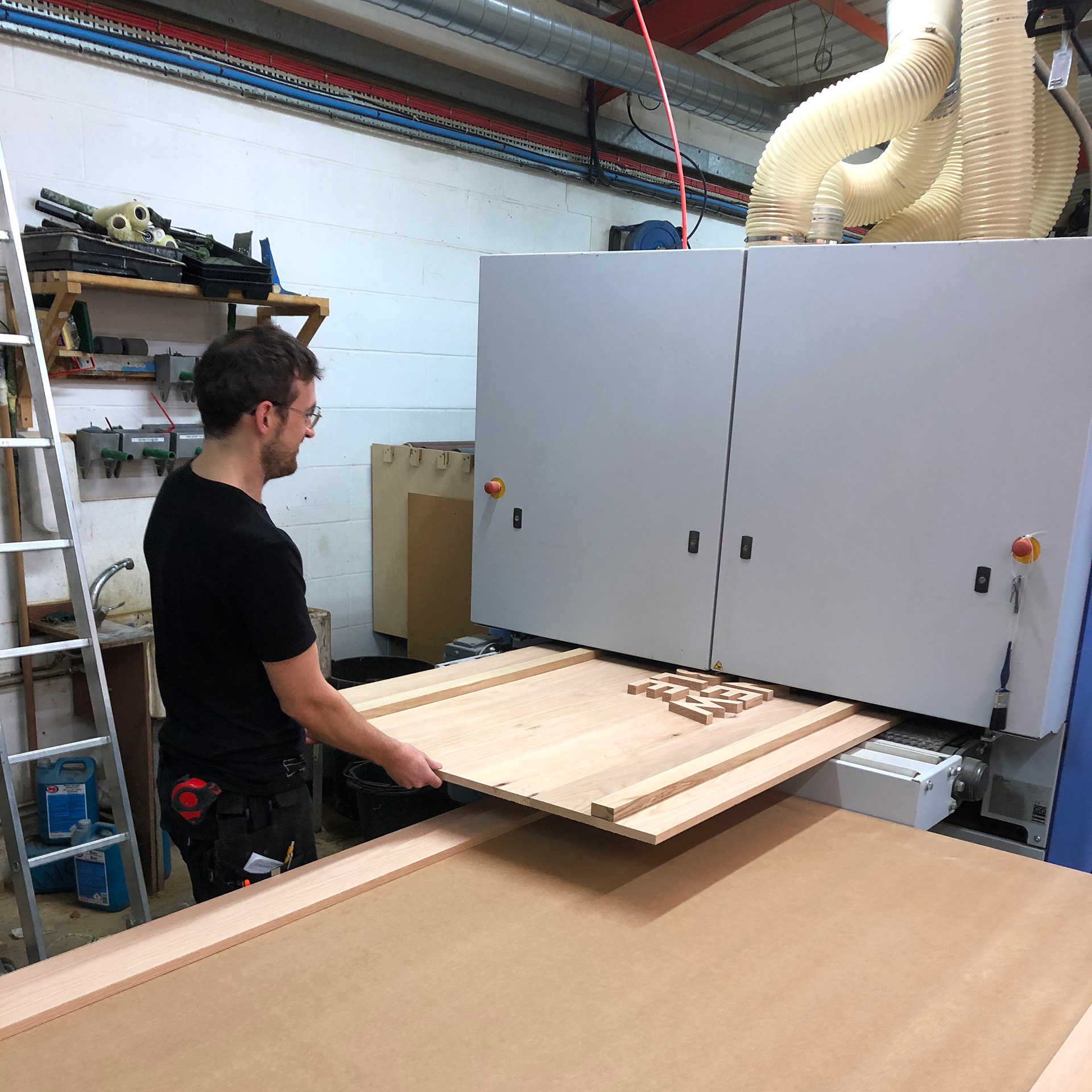
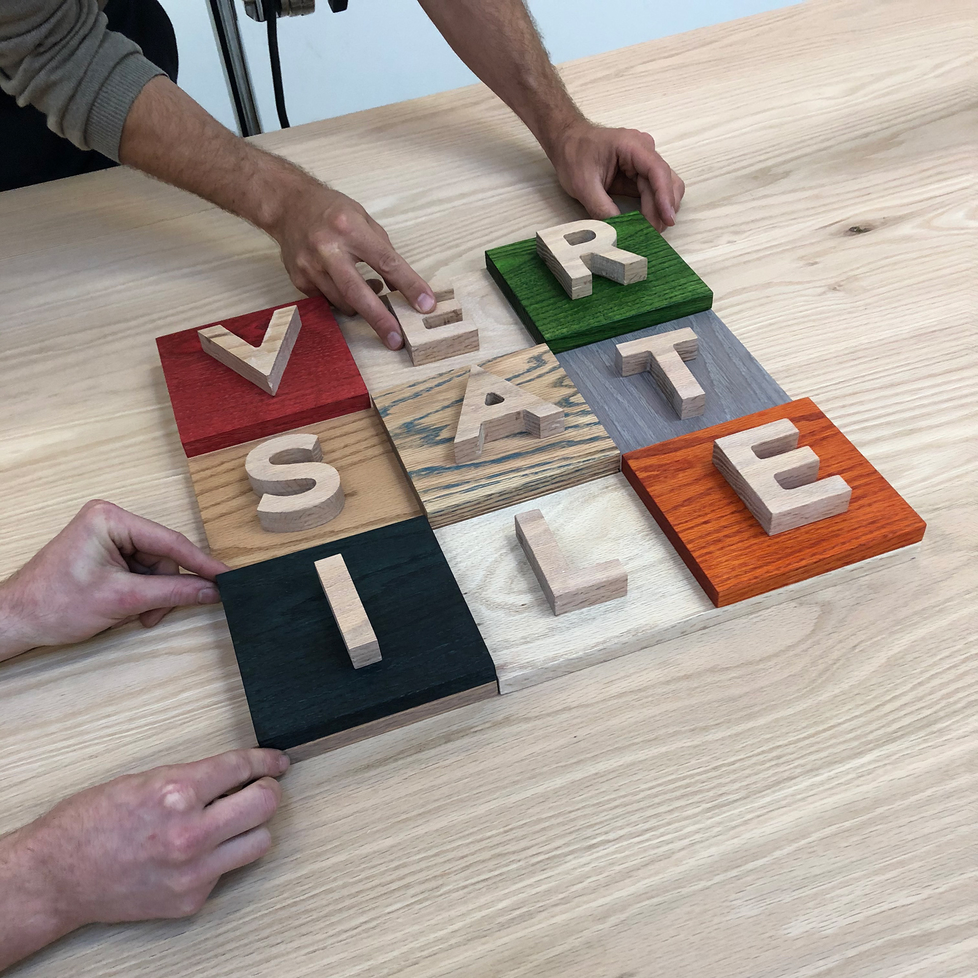
Working closely with furniture workshop Benchmark and photographer Petr Krejci, we directed a two day photoshoot capturing around 700 stop frame images, as well as high resolution stills for the print campaign. These were then turned into short videos in After Effects for the social media campaign , animated gifs for web banners and print ads
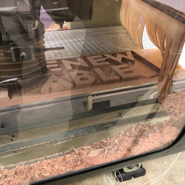
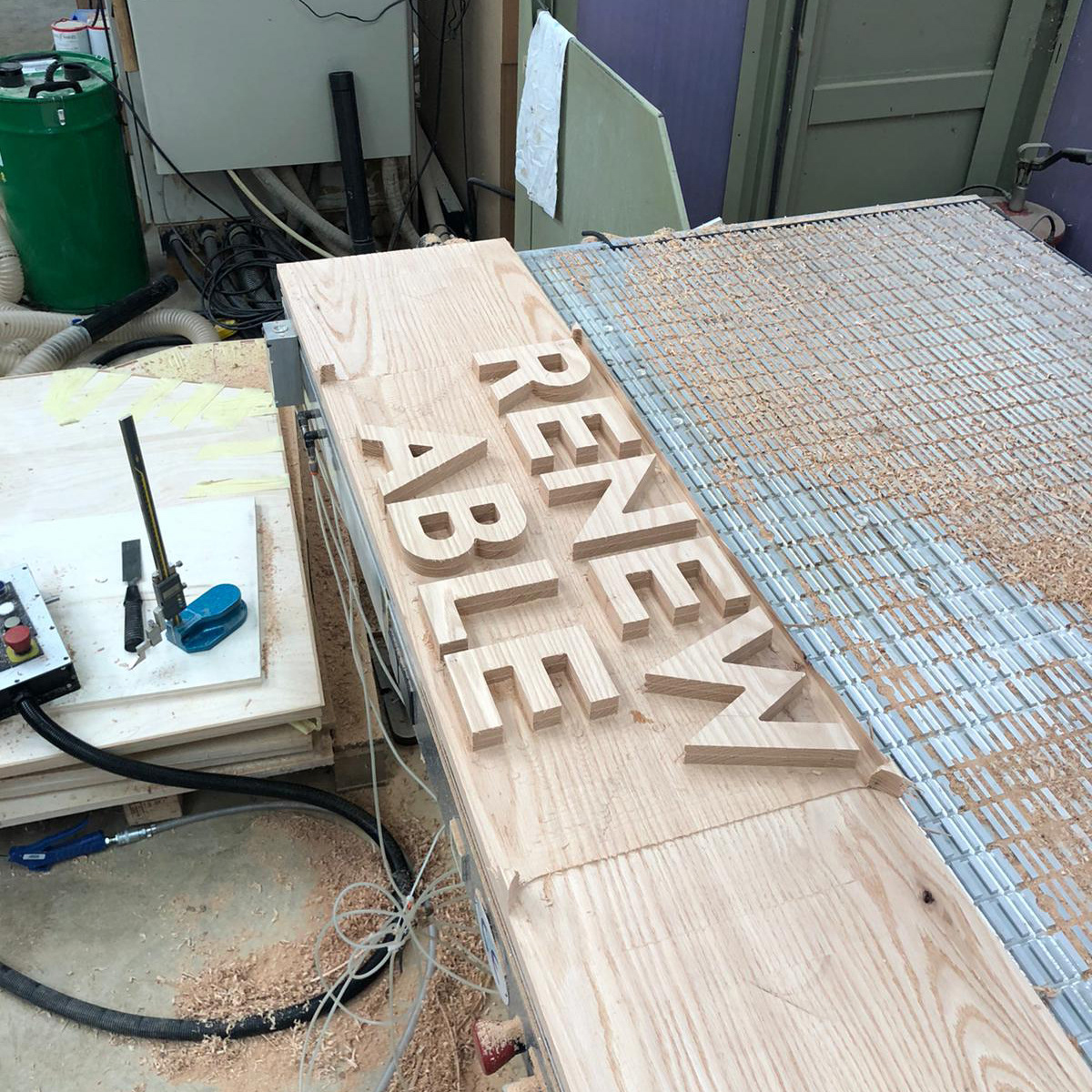
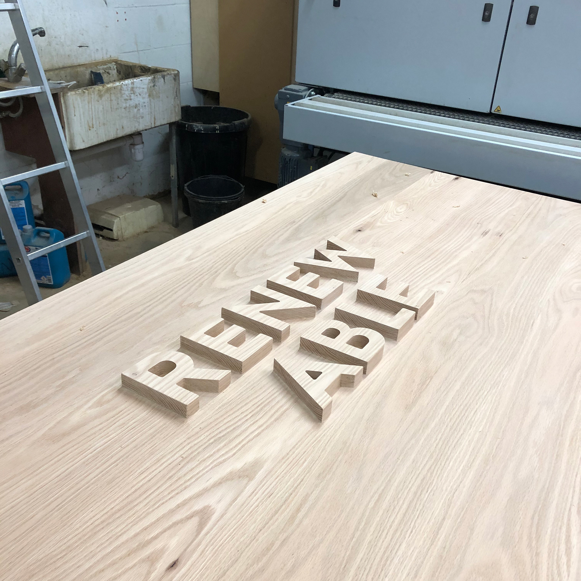
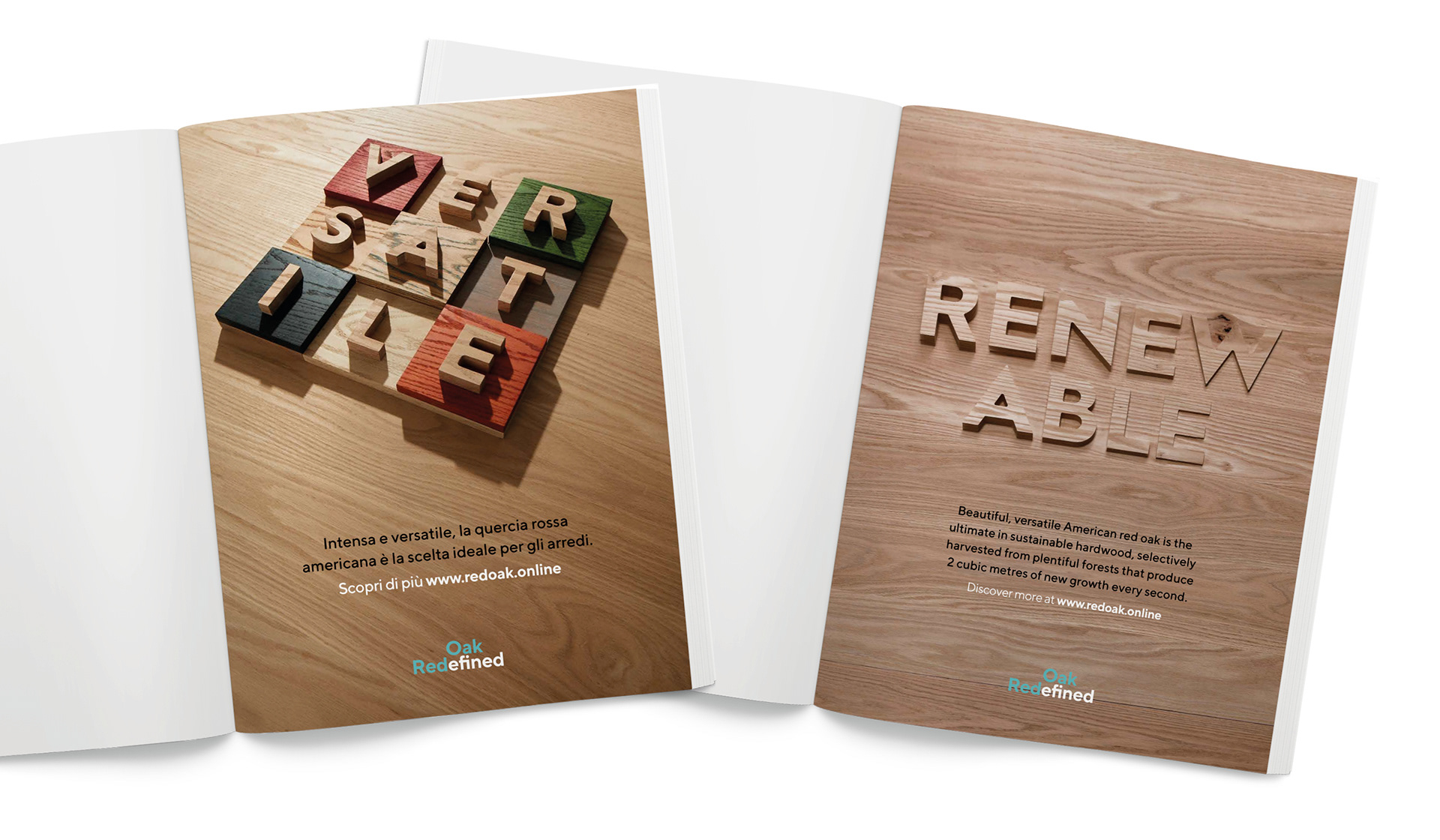
For the keyword ’RENEWABLE, we asked Benchmark to CNC cut the word out of a single piece of Red Oak. We then passed this through a machine sander over 80 times and reversed the frames, to create the effect of the wood renewing itself
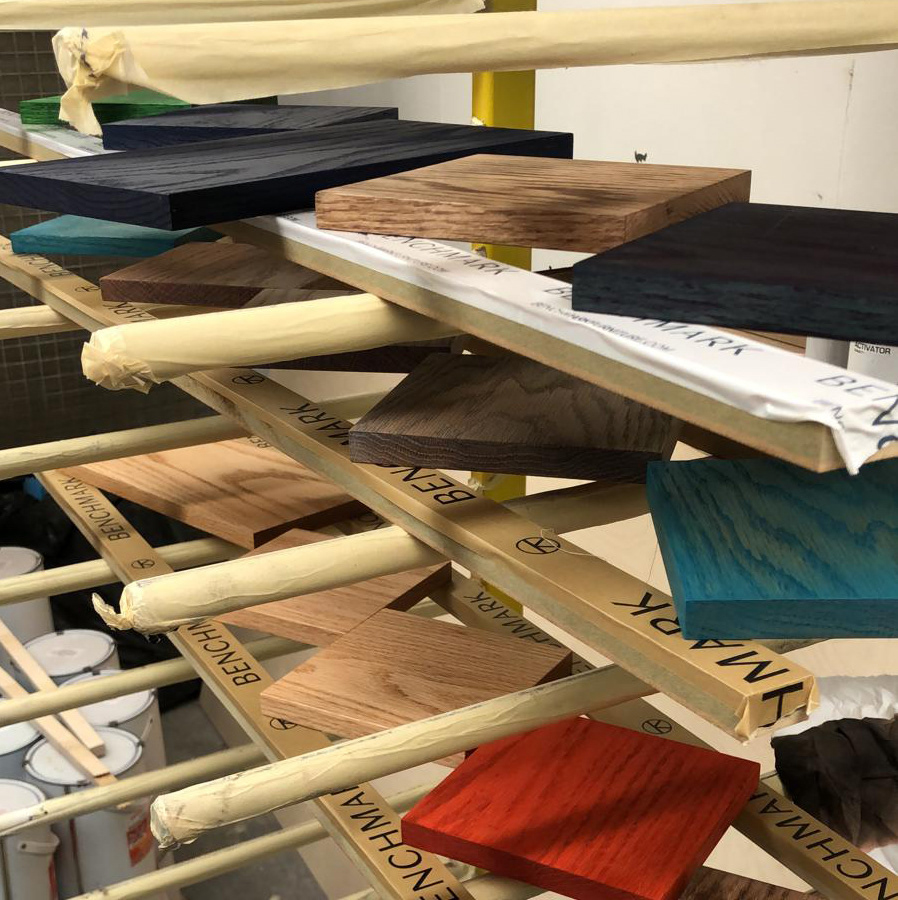
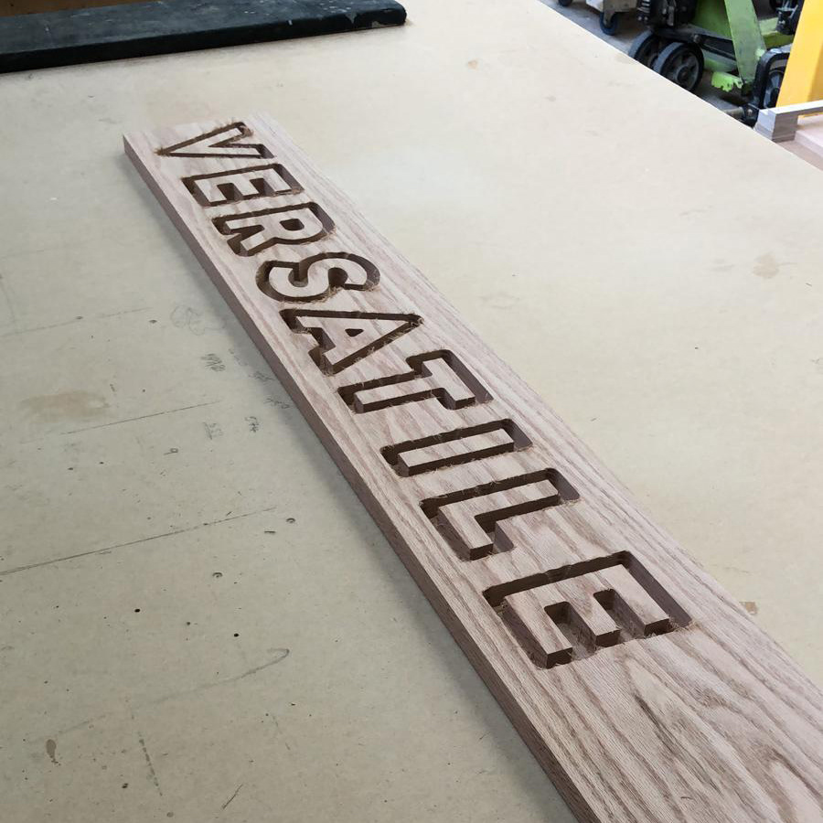
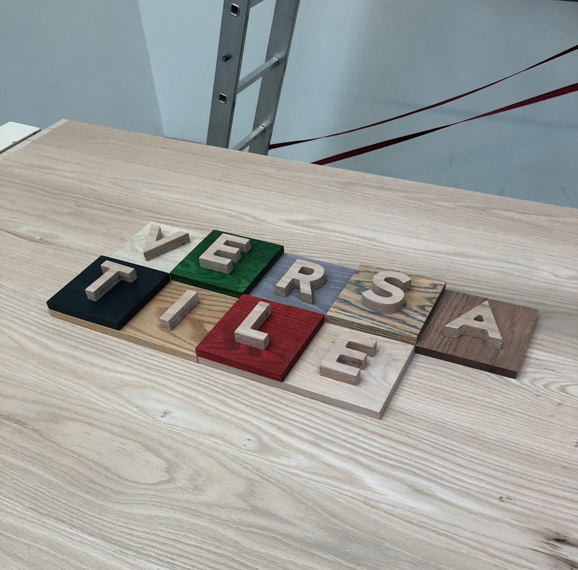
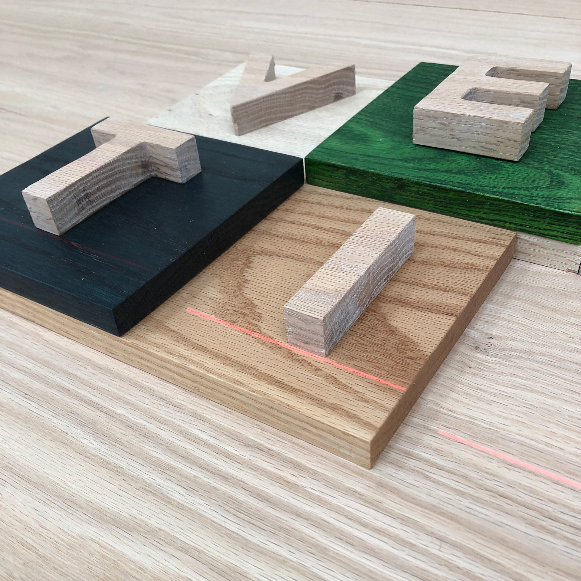
For the keyword ‘VERSATILE’, we asked Benchmark to stain a series of small Red Oak tiles using some of the various colours and finishes that can be used with the wood. We then moved these behind the letters to reveal the word and demonstrate its versatility in construction and product design

Some 'behind the scenes' images from the photoshoot: