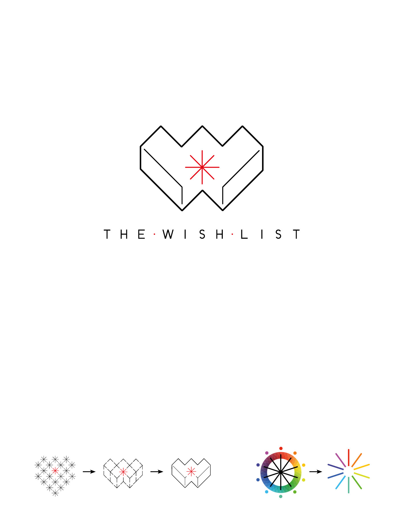
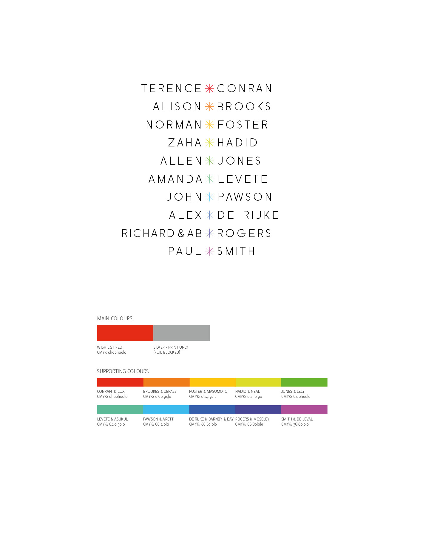
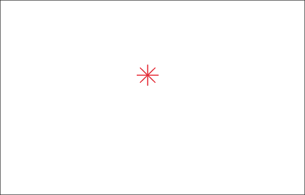
A grid of twenty stars (repesenting the participants) was used to define the logo structure. The central red star repesents terence conran’s vision. The Colourscheme was arrived at by overlaying a ten pointed star onto the colour wheel.


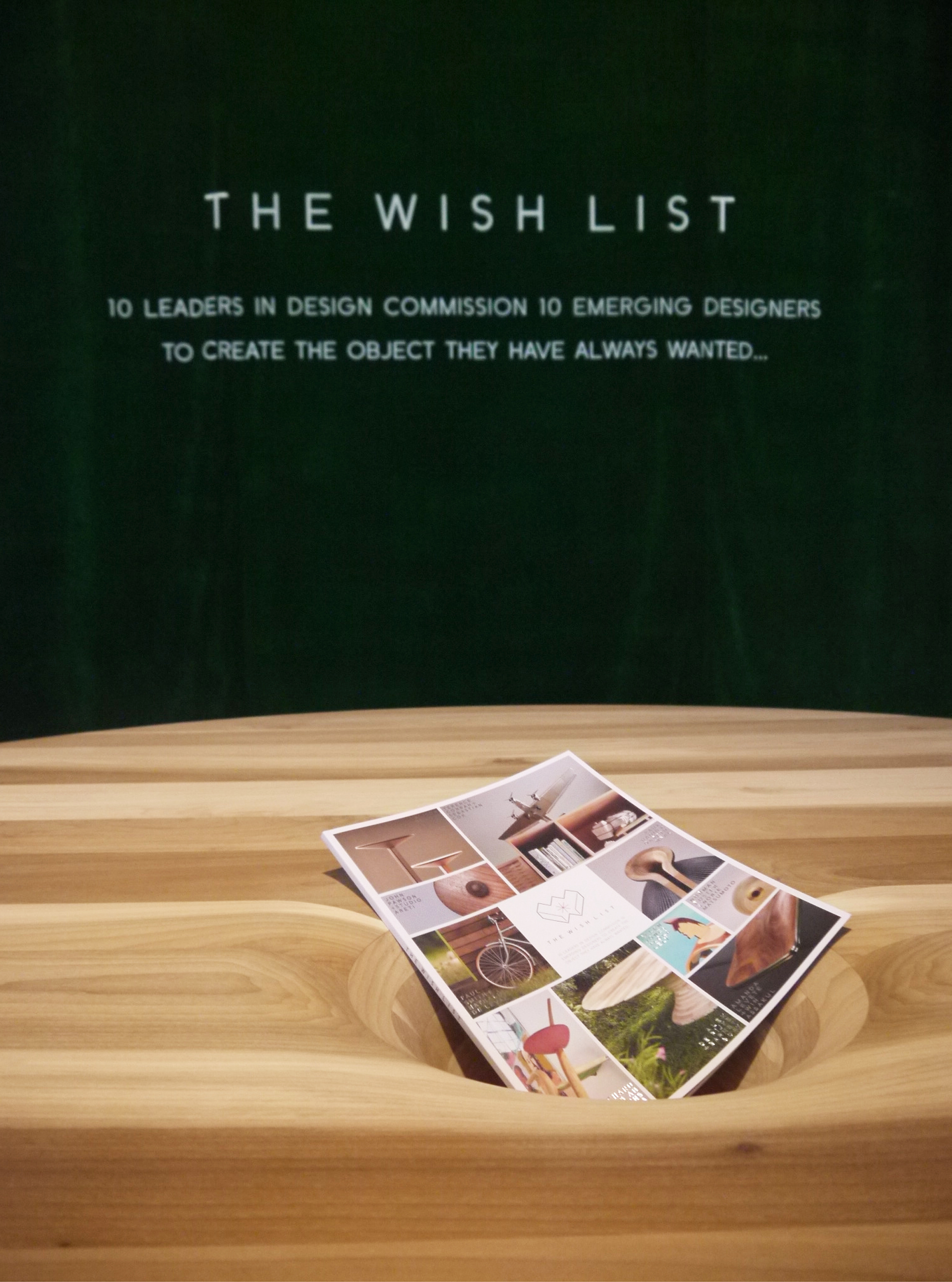
Using offcuts from the projects themselves, I created a 3D version of the logo in oak and inlaid walnut and photographed it in situ to use in promotional material
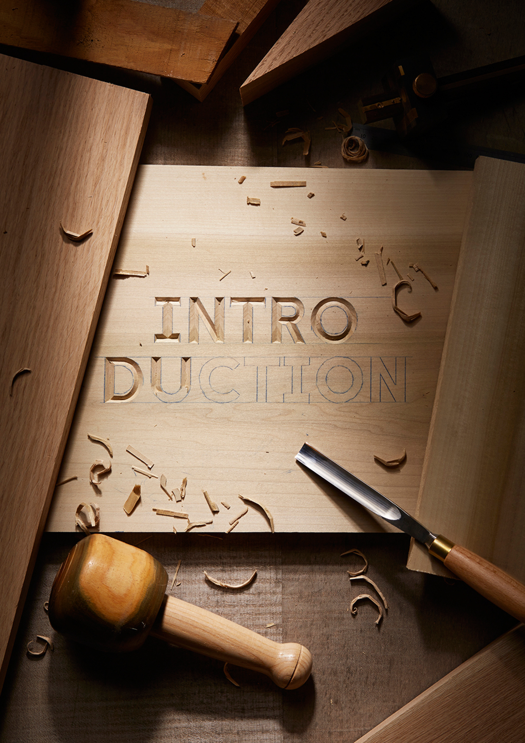
I shot typographic 'still life' compositions to use as section breaks for the brochure


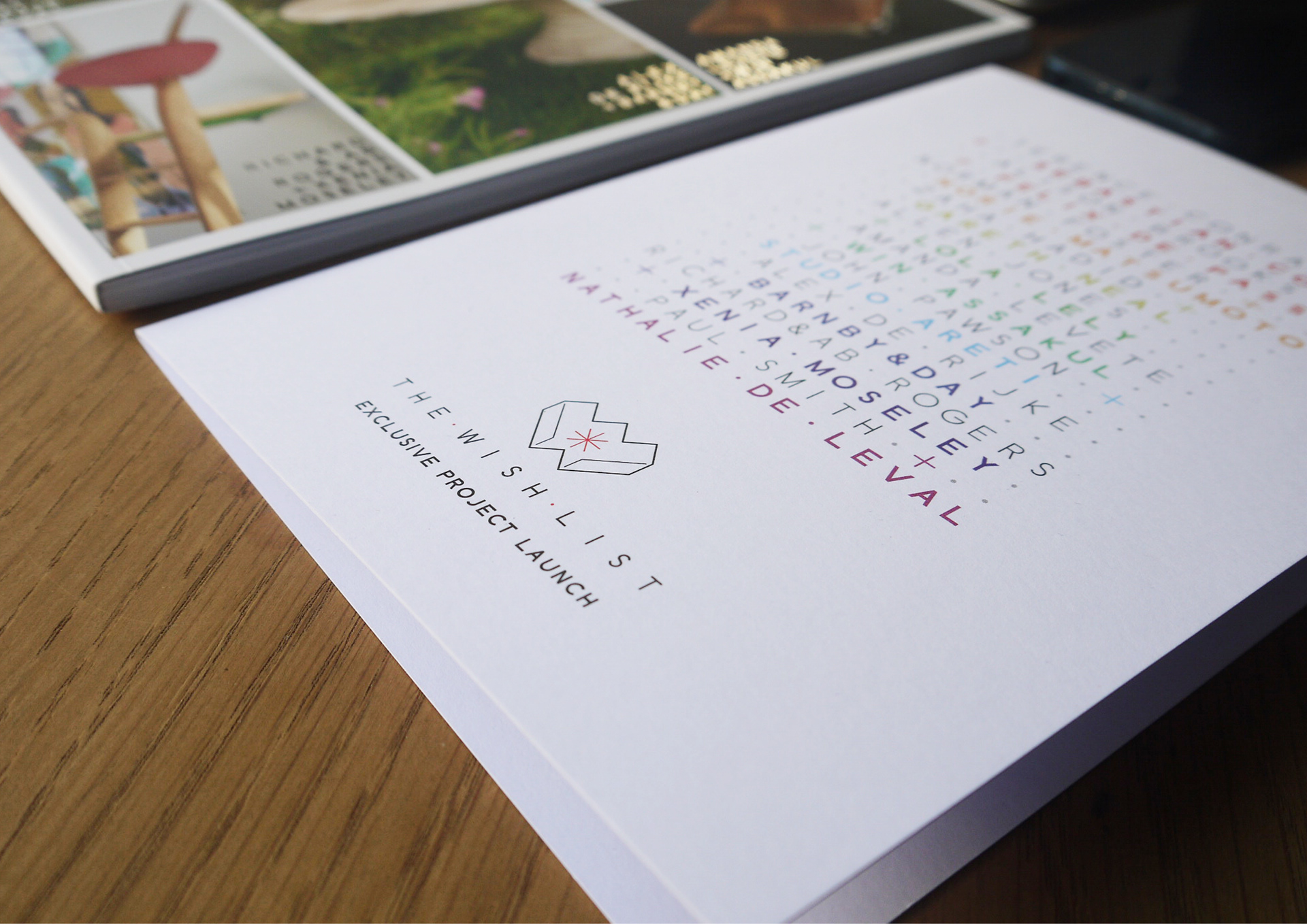
For the cover of the brochure I chose foil blocked type on 300gsm 'Soft Touch' Matt Laminate

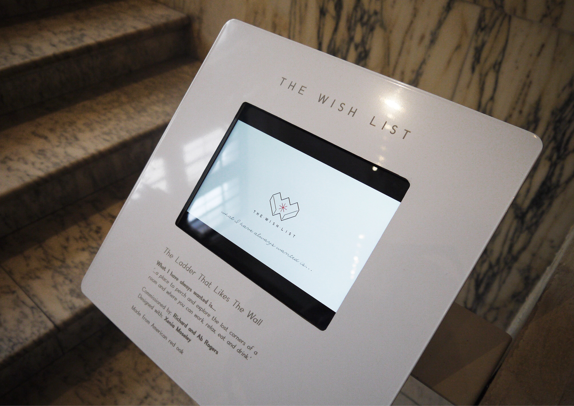
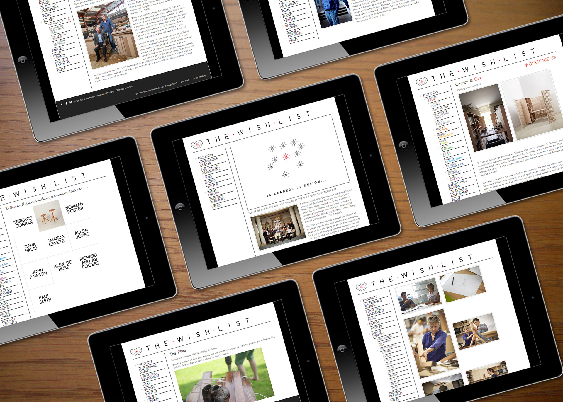
Video graphics and on-site information design at the V&A