The World of Wood Festival / Project was a six-week celebration of global timber and forests timed to coincide with the COP26 climate summit
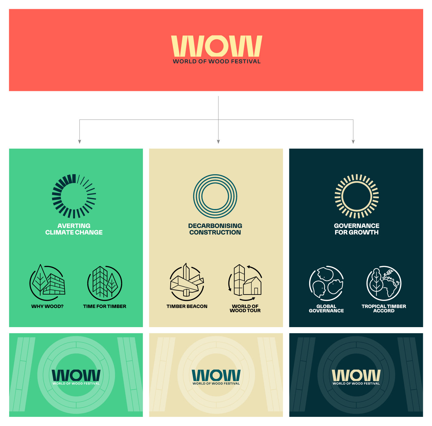
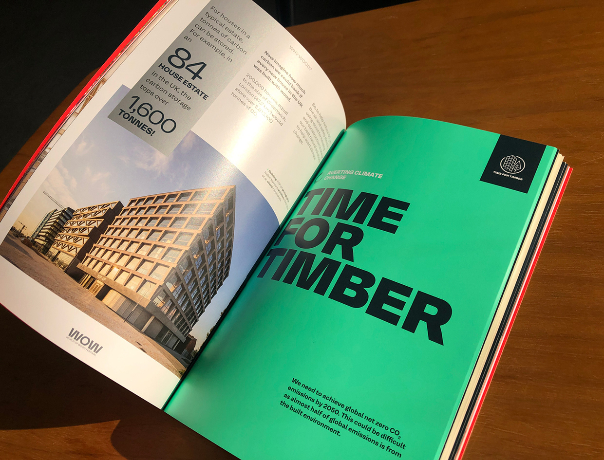
Hosted by Timber Trade Federation, it told the story of how global forests and the wood products cycle are helping to avert climate change, decarbonise construction, and support social, environmental and economic growth through responsible governance in developing countries.
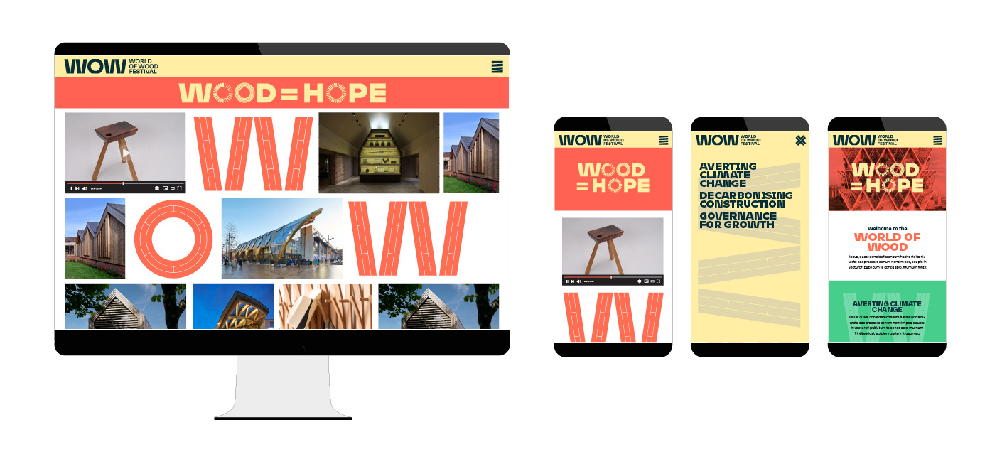
We were invited by the TTF to create a visual identity for the project that would appeal to a diverse audience from global policy makers to architects to the general public, and project the message that ‘Wood is hope’
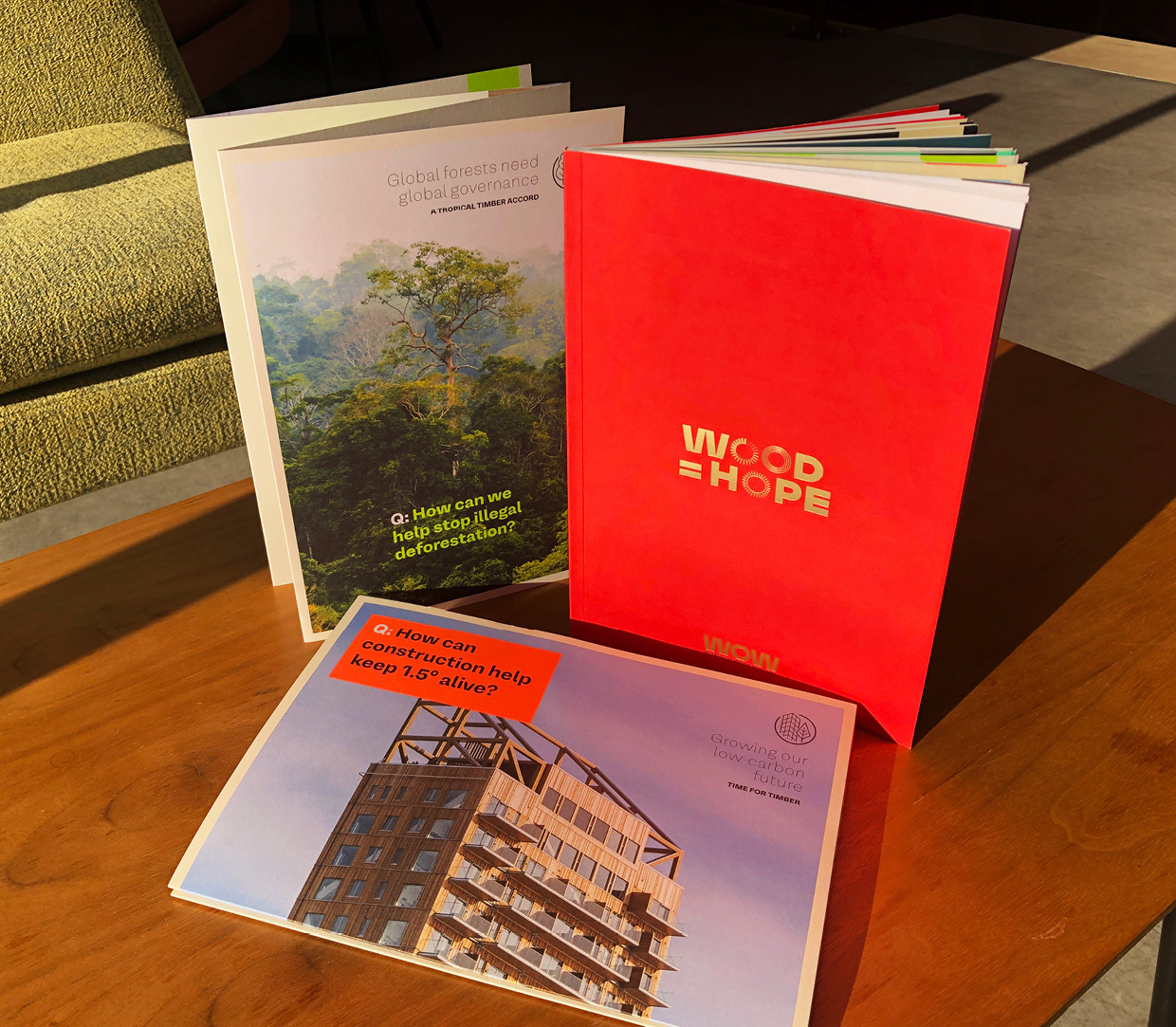
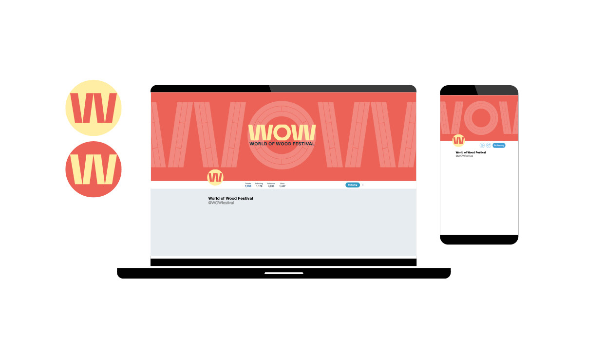
the identity needed to be flexible enough to work across multiple platforms and channels. As well as a website to host video content, we designed a bespoke app, social media pages, an 80 page printed brochure, 8pp ‘manifesto’ flyers, and event graphics for the exhibition space in the Building Centre venue in London
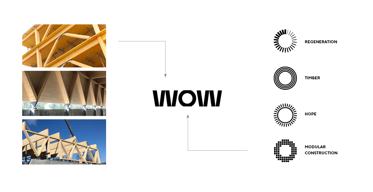
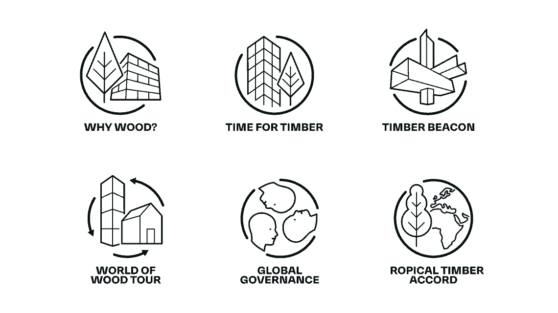
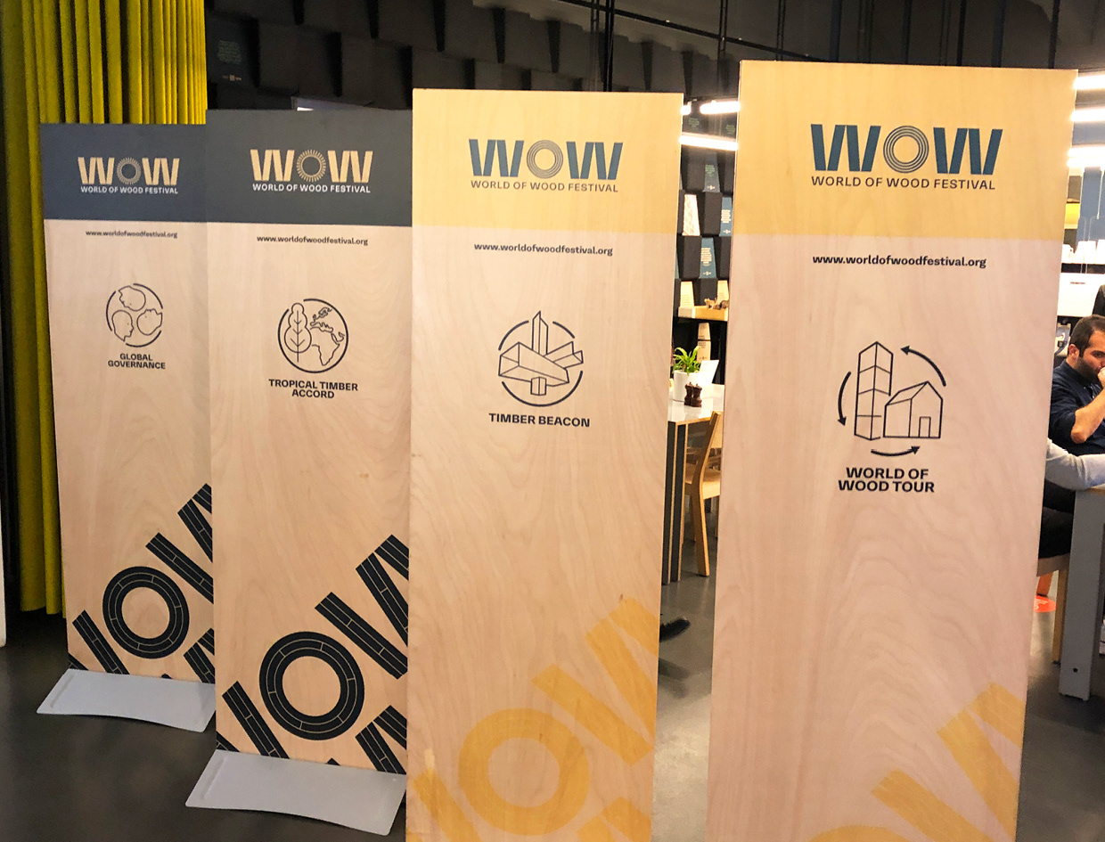
the W letterforms in the logo were designed to reflect the structure of innovative high rise timber buildings, and the O was used as a flexible space for symbols representing key themes of the project
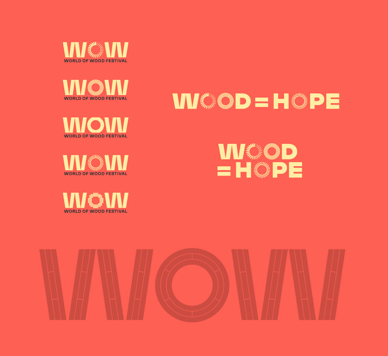
Noticing how frequently the letter ‘O’ featured in logo and key messaging, We created a flexible branding system that allowed the letter ‘O’ to be replaced by symbols representing the key themes of the project
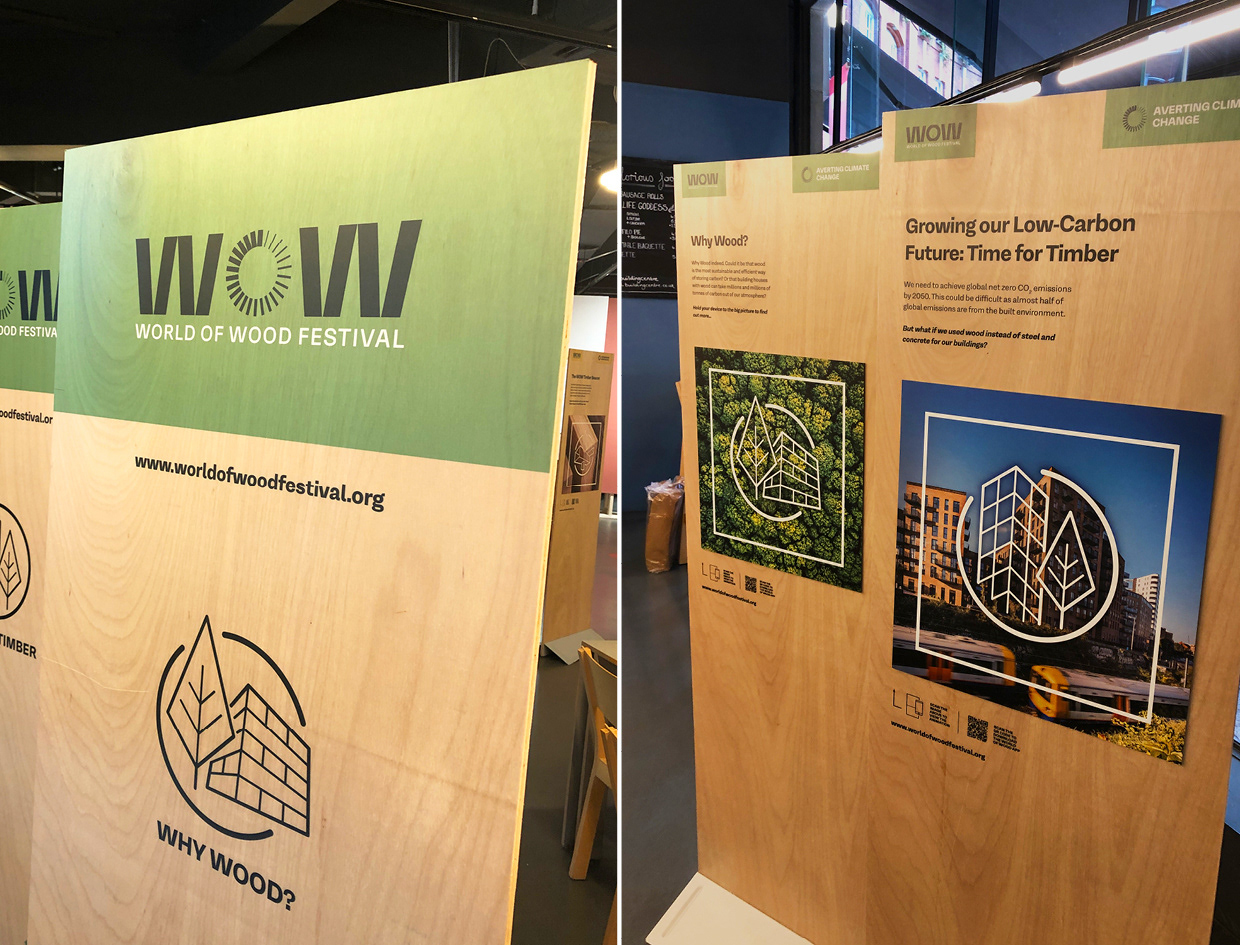
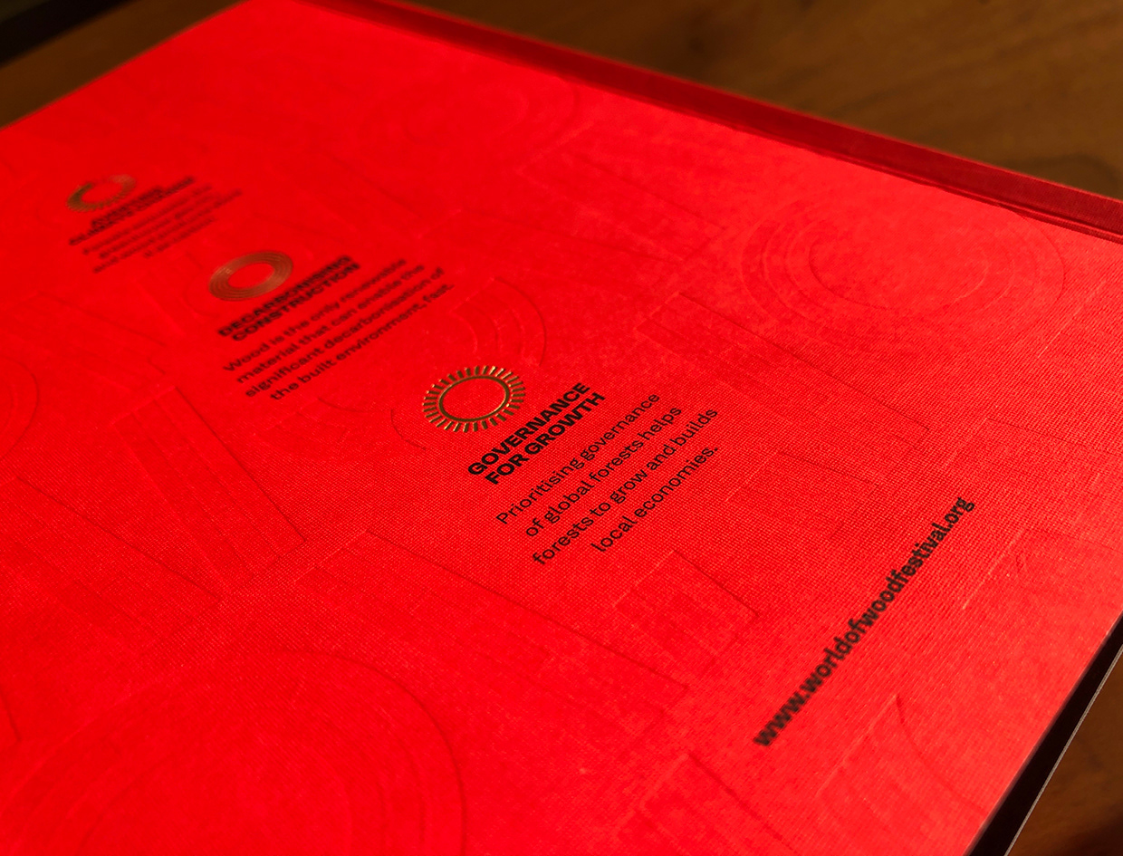
A more detailed version of the WOW logo was created for use as a large supporting / background graphic. It was adapted to appear as if created from Cross Laminated Timber, Aa technique credited with revolutionising the timber industry, allowing timber to be used in construction at a much large scale
The identity featured a toolkit of visual assets created for use in different applications. These included logo variations, supporting graphics, and 2 sets of bespoke icons representing key project themes and app functions
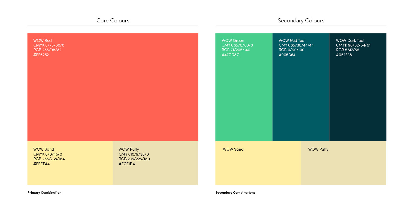
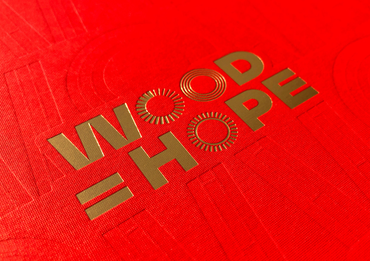
The colour pallete was carefully selected to reflect the different themes running through the project. We selected a vibrant red and a softer yellow as core colours to reflect the positive ‘wood is hope ‘ message and these were combined with secondary colour pairings to reflect the more technical and political secondary themes
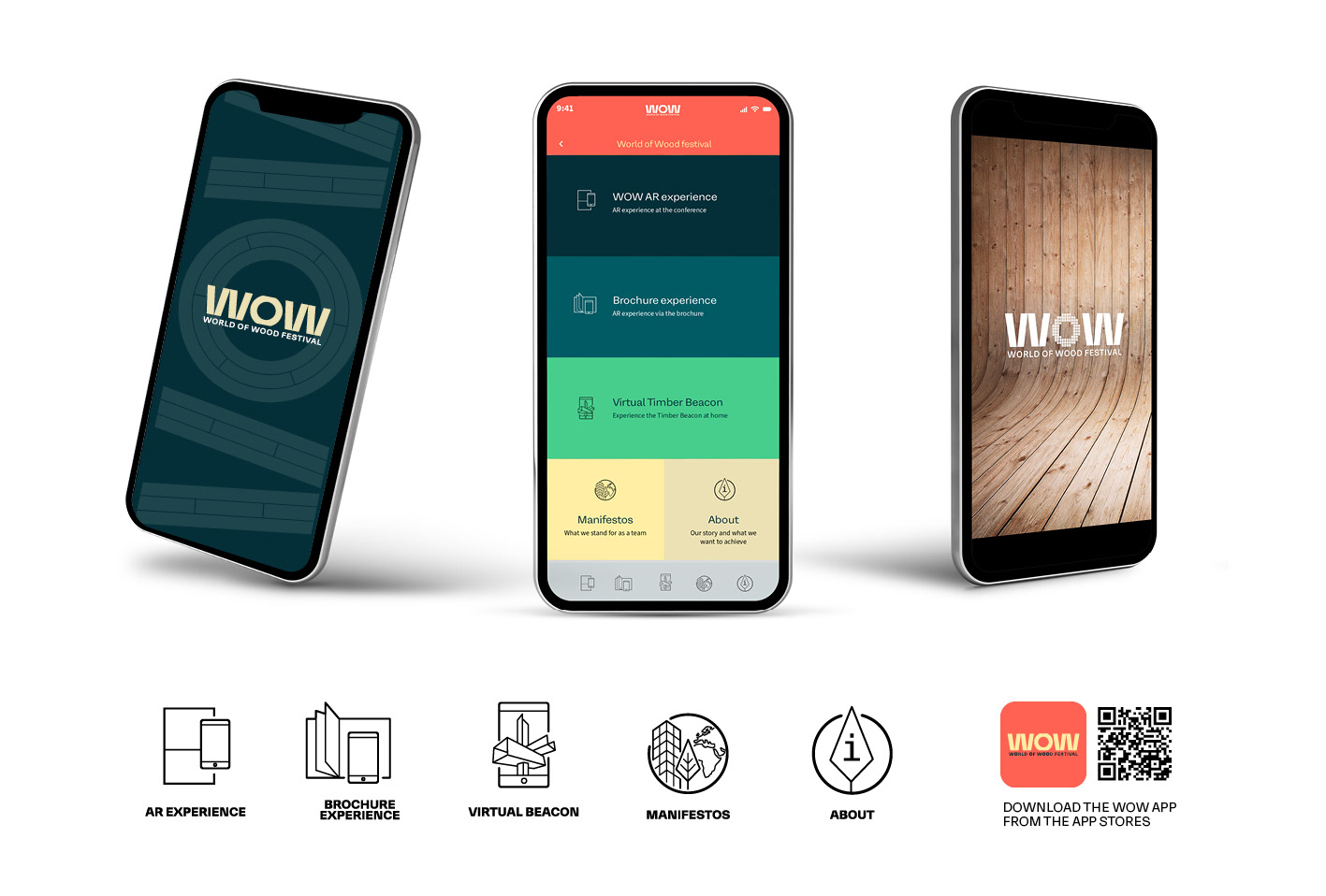
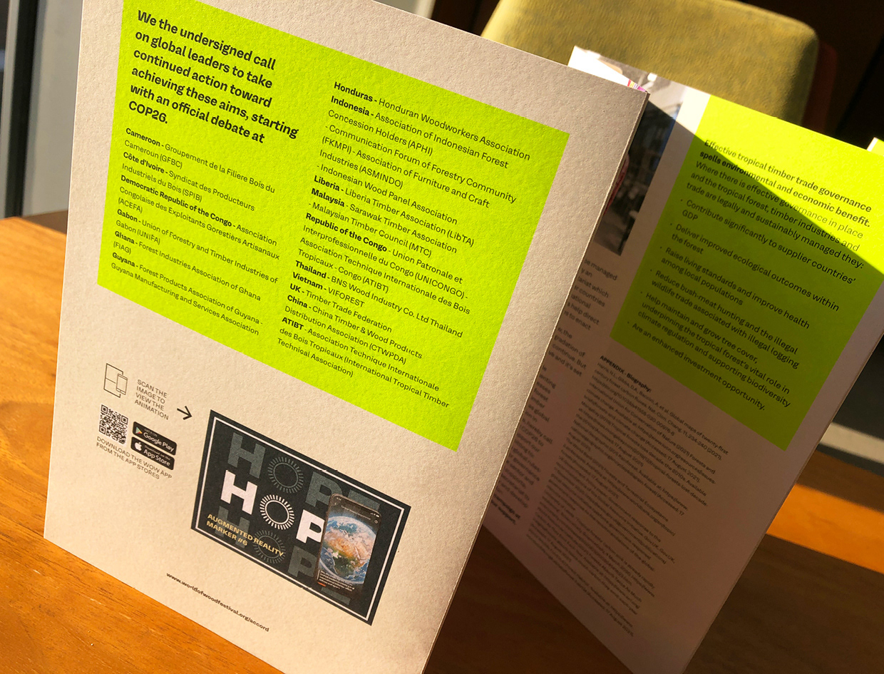
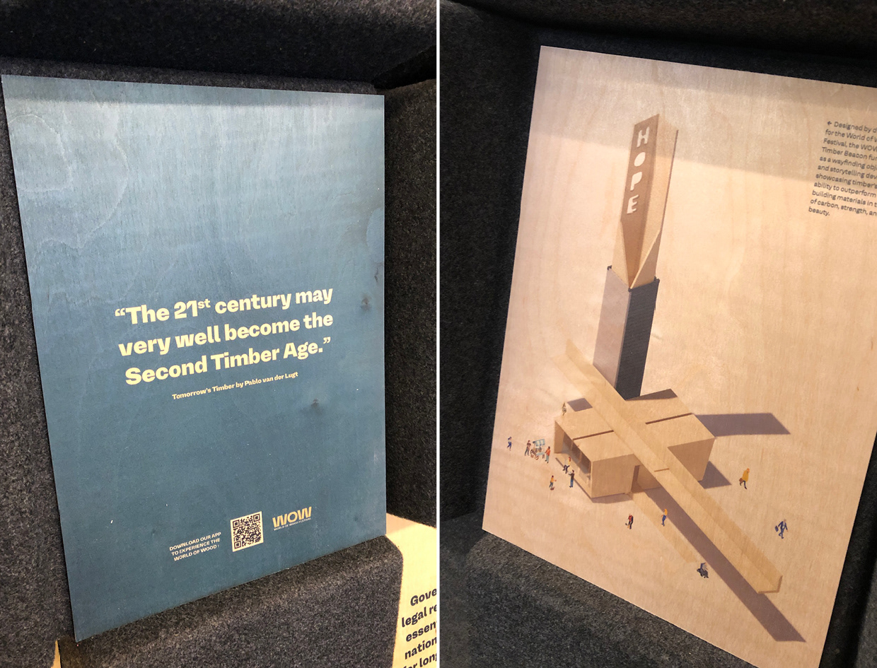
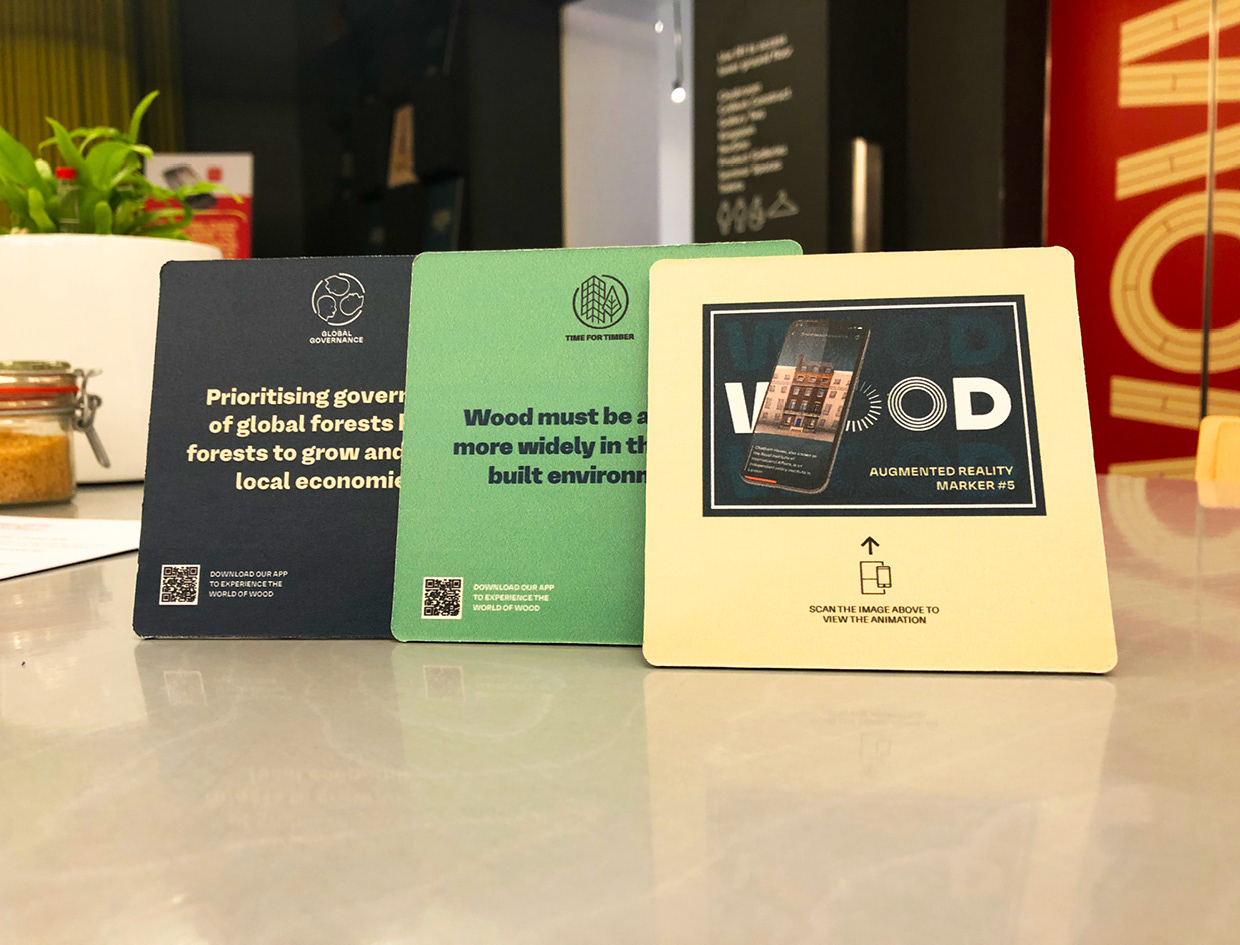
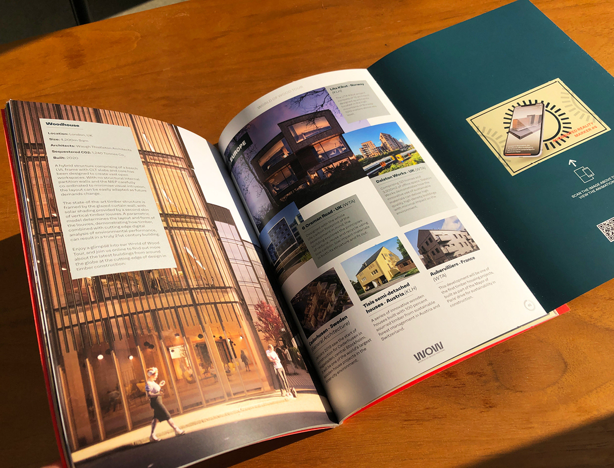
We worked closely with the studio immersion.one to create Augmented reality (AR) ‘touchpoint’ graphics that were incorporated into large scale exhibition panels, brochure, flyers, and coasters. These graphics triggered various 3D animated interactions within the bespoke app created for the project, delivering messages relating to the key themes
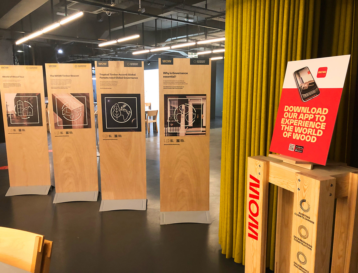
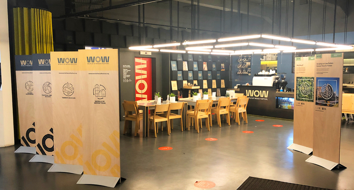
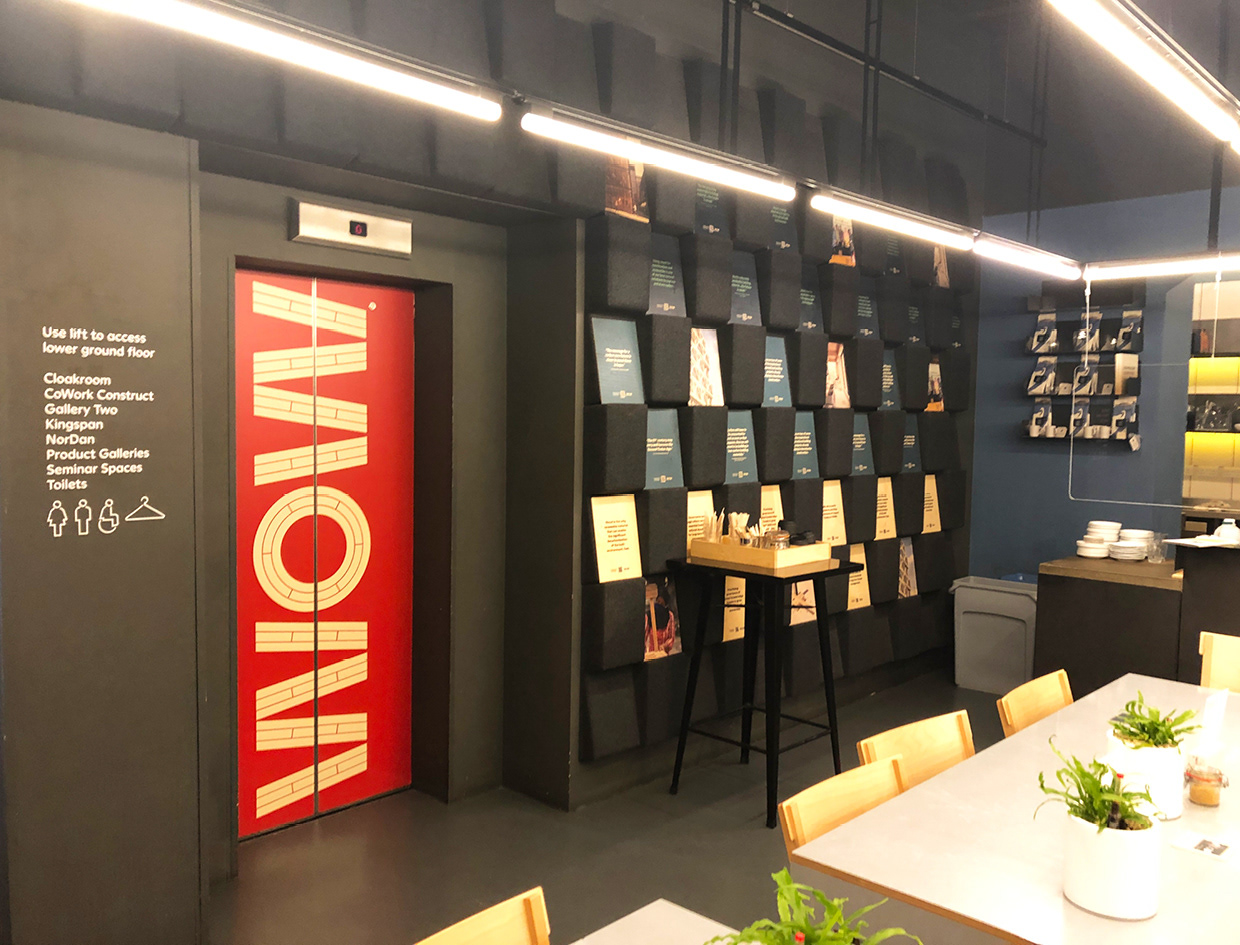
The exhibition element of the festival took place at the building centre in central london. We curated a full takeover of the entrance space including exterior banners & vinyl window graphics, 6 full height plywood interactive information panels, a ‘book nook’ wall of 40 A3 plywood panels and branded coasters , each containing different timber related quotes or images. All elements incorporated ‘touchpoint’ graphics that visitors could scan using a bespoke app to access the parallel AR digital experience


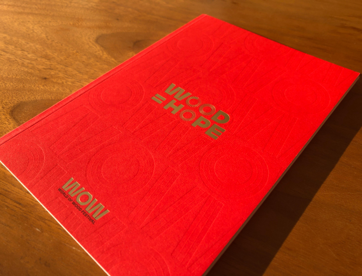
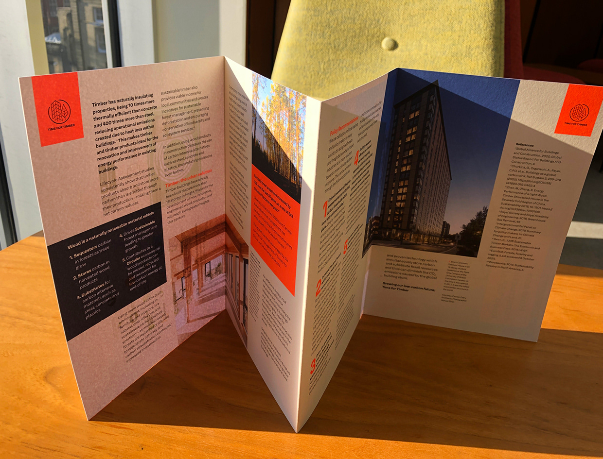
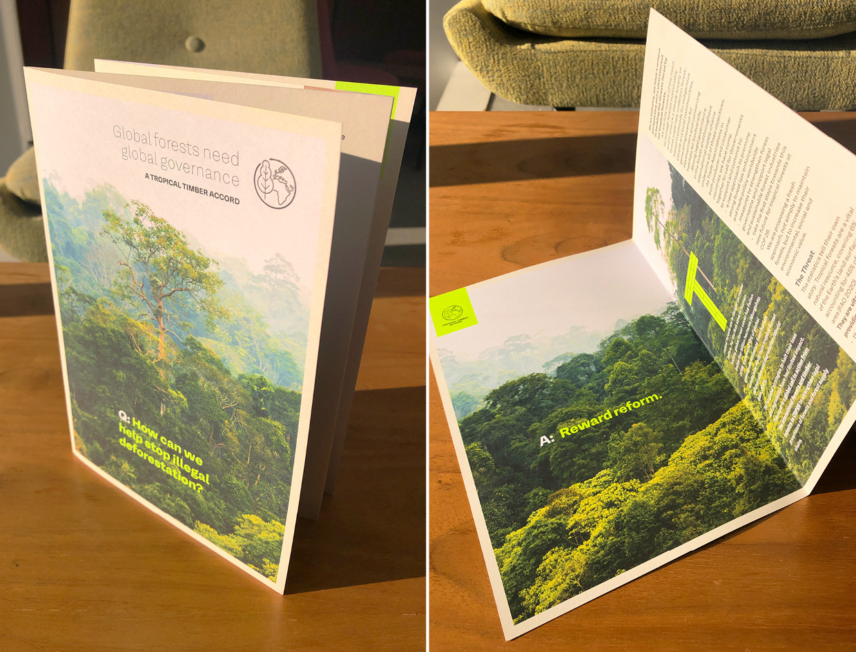
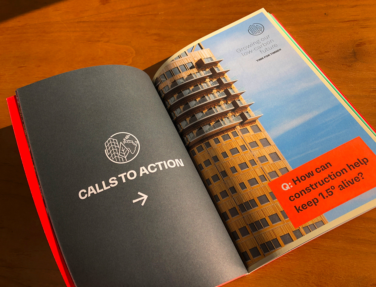
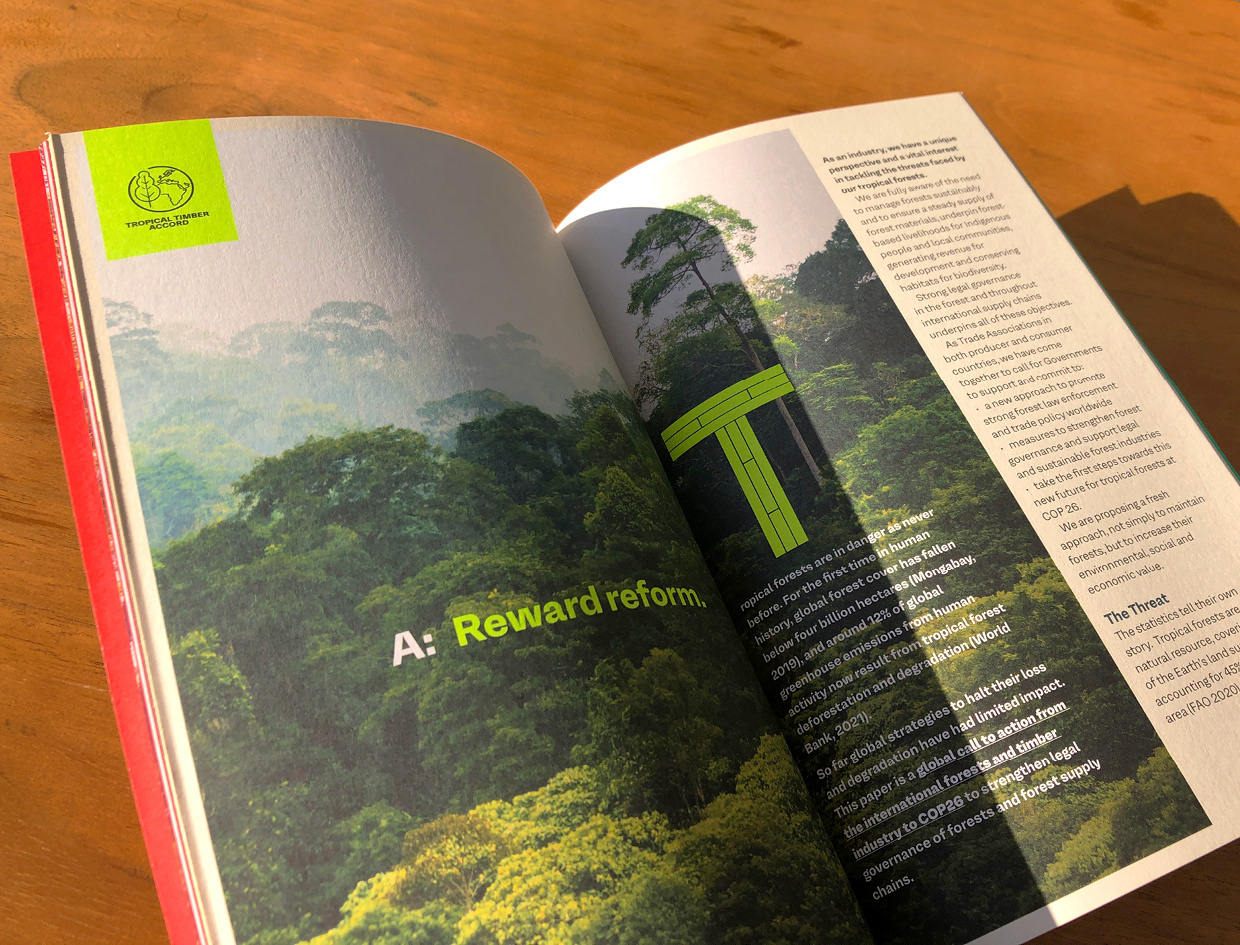
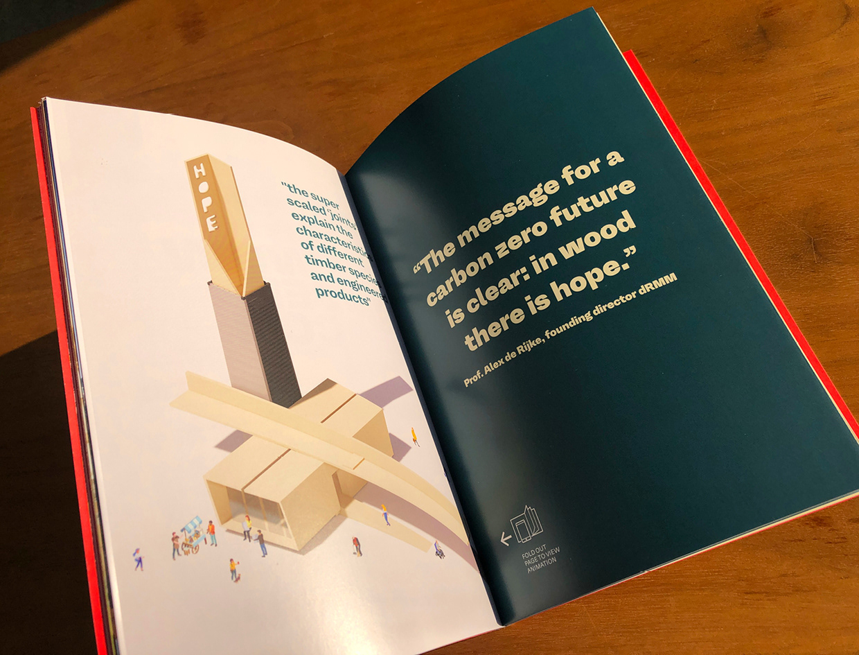
The 80 page brochure was printed in 3 disctinct sections, each with different paper stocks and inks . The covers were foil blocked onto GF Smith textured Colorplan , and were embossed with a repeated pattern representing Cross laminated timber . The ‘manifestos’ section was printed 6 colour on uncoated stock with 2 flouro inks . The ‘touchpoints’ section was printed 5 colour with a metallic silver on coated silk stock with 6 fold-out pages that allowing the reader to view the interactive AR animation
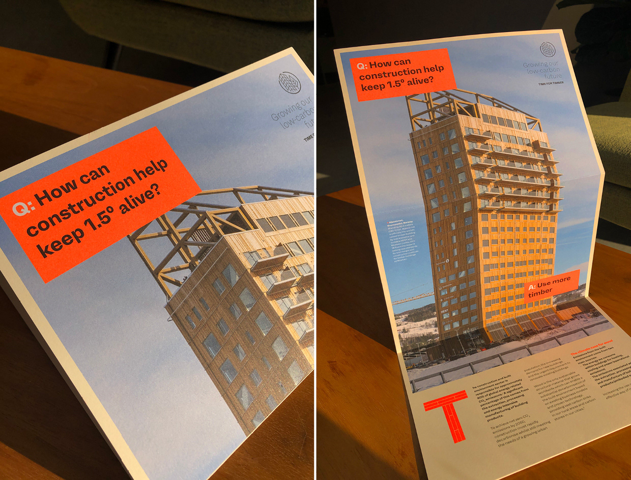
We chose concertina - fold flyers as the perfect format to convey key messaging; a tall vertical concertina fold ‘reveal’ to show an innovative Norwegian timber skyscraper, and a wide horizontal format to convey the scale of global forests . These were litho printed with flouro inks on uncoated 300gsm card